UX Generation
This project was completed in 2022 as my graduation project for the Visual Design degree at ESPM. It was developed over three semesters and resulted in a comprehensive 200-page documentation. This page presents an extremely condensed version, highlighting only the main aspects of the work.
This project can be divided into four stages: Marketing Plan, Theoretical Framework, Methodology, and Development. Here, I intend to focus on three key aspects: the Marketing Plan, Methodology, and Development — with a stronger emphasis on the development phase and its results.
Clients:
Kobe

Marketing Plan
At the time of this project, I was Head of Design at Kobe, a Brazilian software house specialized in developing high-quality digital products for clients ranging from startups to large enterprises. Kobe is recognized for its strong user-centered design approach and technical expertise.
However, the company had identified a significant challenge: many entrepreneurs approached Kobe with innovative ideas but lacked the business maturity and financial resources to hire our traditional custom development services.
To address this gap, I developed a comprehensive Marketing Plan as part of my graduation project. It consisted of several analytical stages:
1. Company Analysis
- Reviewed Kobe’s history, team structure, resources, and market positioning.
- Confirmed Kobe’s reputation for delivering premium digital products and solutions.
- Highlighted the gap in serving early-stage entrepreneurs with limited budgets.
2. Market and Environmental Analysis
- Studied economic, technological, sociocultural, demographic, and political-legal factors impacting Brazil’s digital and startup ecosystem.
- Noted the rapid growth of startups and increasing demand for online learning.
3. Competitor Analysis
- Analyzed key players like SoftDesign, Cheesecake Labs, and Poatek.
- Compared their services, communication strategies, and positioning.
- Identified opportunities for Kobe to differentiate itself through a scalable digital product.
4. Consumer and Market Research
- Conducted qualitative and quantitative research to understand potential users’ motivations, needs, and decision-making processes.
- Found a significant market of entrepreneurs needing guidance to develop and validate their digital business ideas.
5. SWOT Analysis
- Strengths: highly skilled team, strong UX focus, design-driven culture.Weaknesses: high costs for custom projects, dependency on large clients.Opportunities: growing digital market, increasing popularity of online learning.
- Threats: strong competition, economic instability.
6. Strategic Objectives
- Create Kobe’s own digital product to help entrepreneurs build maturity in their businesses.
- Expand Kobe’s reach to segments previously underserved due to budget constraints.
- Generate sustainable, recurring revenue streams beyond custom service contracts.
7. Financial Feasibility
- Developed financial projections including costs, revenue forecasts, and ROI scenarios.
- Structured an accessible subscription model to make the product affordable for small businesses and startups.
The Marketing Plan provided a solid roadmap, confirming the viability and strategic alignment of the proposed platform. It highlighted how Kobe could transform an identified market gap into a sustainable business opportunity. This strategic foundation set the stage for the next phases of the project, ensuring that design, UX, and technical development would all be guided by clear business goals and market insights.
Methodology
The methodology chosen for this project was based on Jesse James Garrett's framework from "The Elements of User Experience." This approach guided the process through five layers: Strategy, Scope, Structure, Skeleton, and Surface. Each layer informed the next, ensuring design decisions were grounded in both user needs and business goals. Research techniques included user research, competitive analysis, and UX design processes. This methodology shaped the development of the platform, ensuring usability, user engagement, and alignment with Kobe’s strategic objectives.
Here’s a brief summary of what was accomplished in each of the five layers:
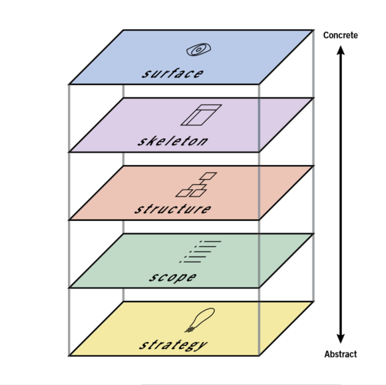
- Strategy: Defined business goals and user needs. Analyzed Kobe’s strategic objectives and market opportunities.
- Scope: Outlined the features and content required for the platform. Created a list of functionalities and educational resources to support entrepreneurs.
- Structure: Designed the information architecture and navigation flow. Developed wireframes representing core user journeys.
- Skeleton: Detailed the layout and interface components. Created low- and high-fidelity prototypes, ensuring usability and visual hierarchy.
- Surface: Developed the final visual design. Applied Kobe’s brand guidelines for color, typography, and style, ensuring a cohesive and engaging user experience.
Development
This chapter presents the key design decisions and outcomes from applying Garrett's methodology to create UX Generation - a gamified learning platform that bridges startup education with practical business application. This is a condensed version focusing on the most relevant insights and solutions for portfolio presentation.
Project Foundation
Product Objectives: Create an accessible entry point for early-stage entrepreneurs, generate recurring revenue for Kobe through subscription model, build a natural pipeline to premium development services, and establish Kobe as a thought leader in startup education.
Product Vision: A customizable learning platform that transforms startup ideas into investment-ready businesses through guided education and practical document creation.
Core Value Proposition Unlike traditional e-learning platforms that only provide content, Geração UX combines learning with doing - users leave with actual business documents, not just knowledge.
User Personas & Key Insights
Based on market research with startup founders and analysis of Kobe's client demographics, two primary personas were developed to represent distinct user segments:
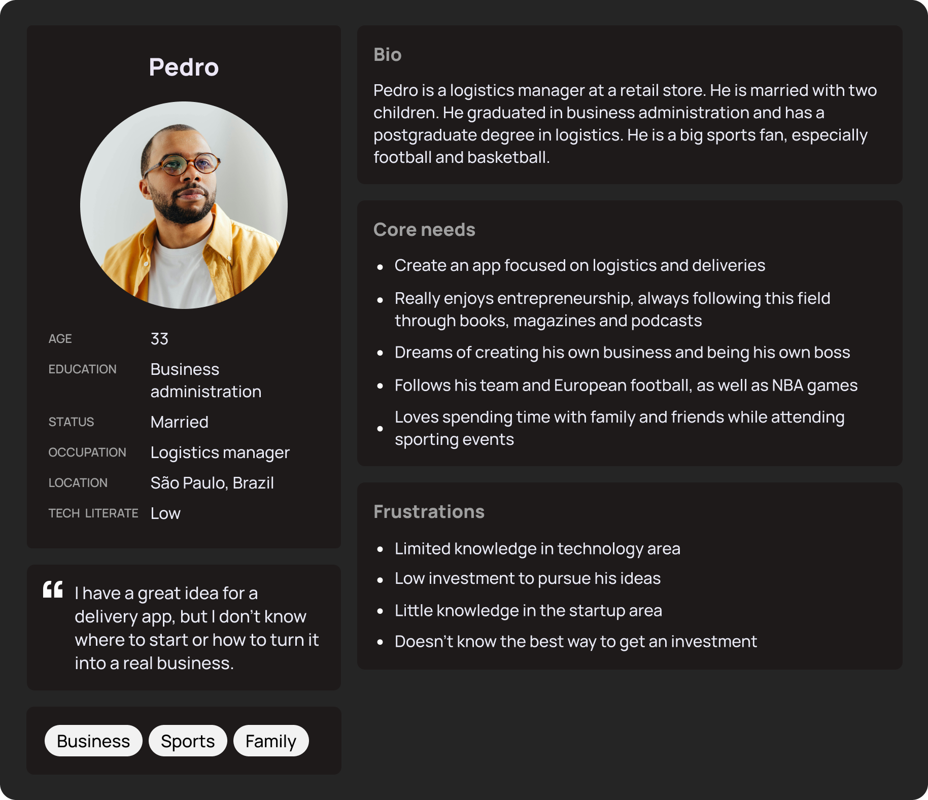
- 33-year-old logistics manager with delivery app idea
- Has business knowledge but lacks startup-specific guidance
- Needs: Structured learning path, confidence building, step-by-step guidance
- Platform behavior: Prefers guided experience with videos and detailed explanations
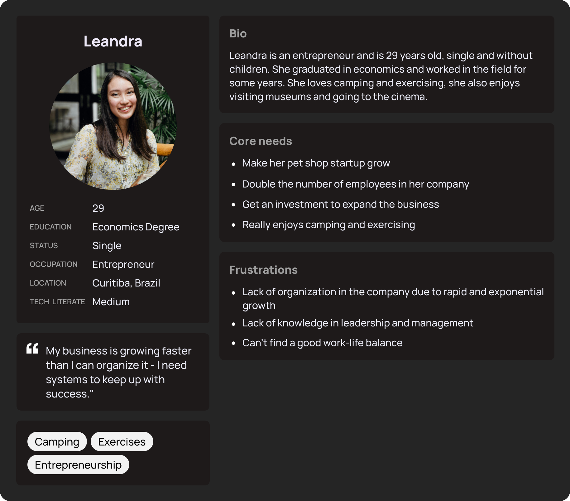
- 29-year-old running e-commerce with 10 employees
- Business is successful but lacks formal documentation and processes
- Needs: Quick templates, organizational tools, team collaboration features
- Platform behavior: Wants efficient, customizable interface with contextual help
Key Design Insight: The platform must serve two completely different user types without overwhelming beginners or boring experienced users. Solution: Adaptive onboarding that creates personalized experiences based on user's declared experience level.
Information Architecture & User Flows
The platform's information architecture was designed using a top-down approach, starting with broad categories and breaking them into logical subsections. The sitemap below shows the complete page hierarchy and how different sections of the platform connect to each other.
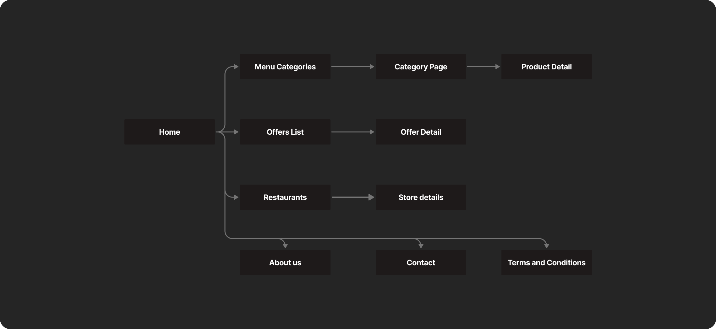
The sitemap reveals the platform's main sections: the customizable dashboard serves as the central hub, the learning section provides structured educational content, and the document editor enables practical application. Each section is designed to work independently while maintaining clear pathways between them.
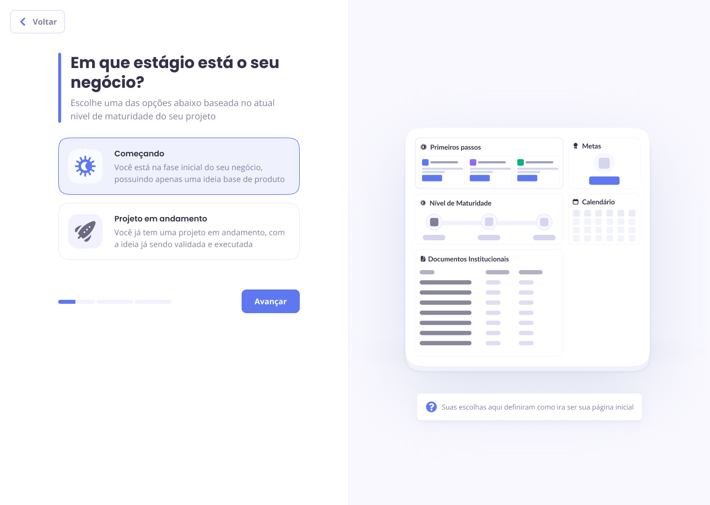
Onboarding Flow Design
A critical challenge was creating a single onboarding process that could serve two very different user types. The solution was an adaptive flow that branches based on user responses, creating personalized experiences from the first interaction.
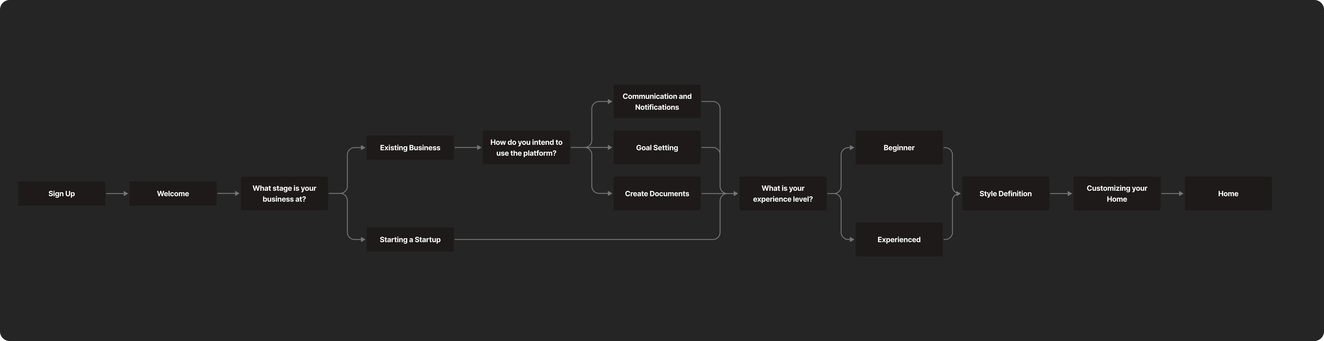
The onboarding flow demonstrates how the platform makes early decisions about user experience customization. Pedro receives a pre-configured dashboard with educational widgets, while Leandra gets organizational tools based on her declared priorities. This ensures immediate value for both personas without overwhelming either group with irrelevant options.
Wireframes
The wireframe development focused on Pedro's user journey as it encompassed all available features and interactions in the system. This approach ensured that the complete functionality was mapped while providing a foundation that could be adapted for other user types.
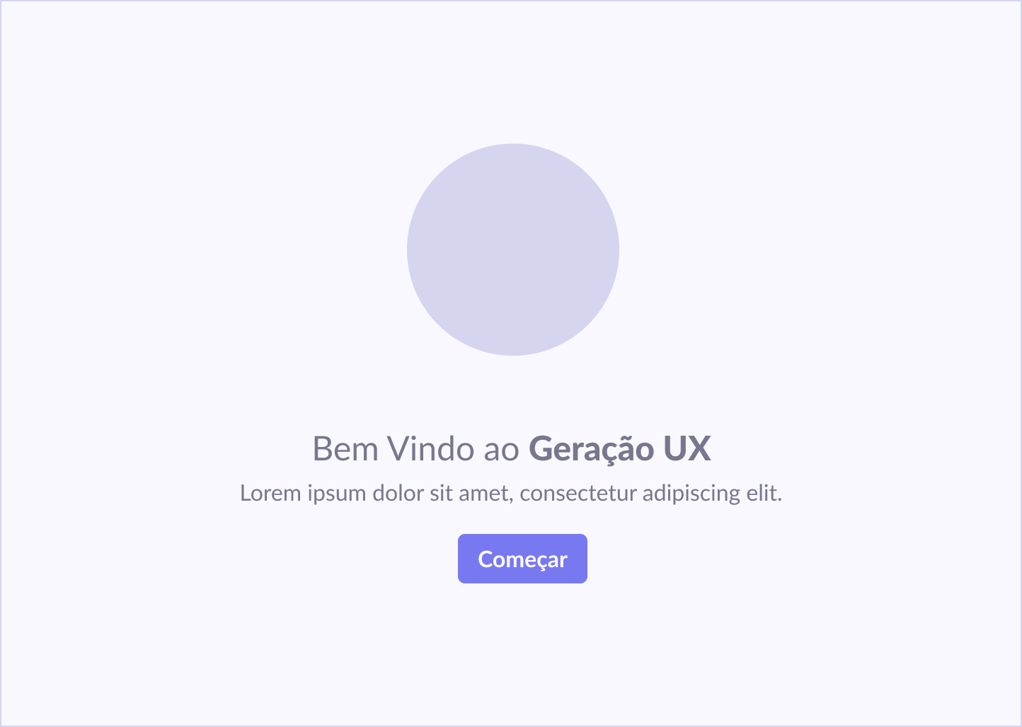
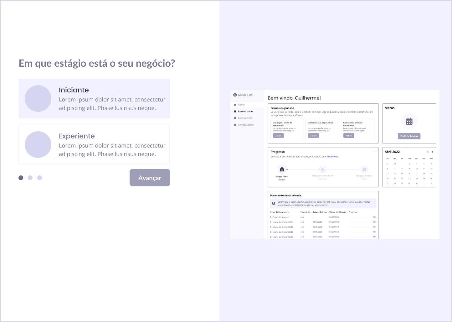
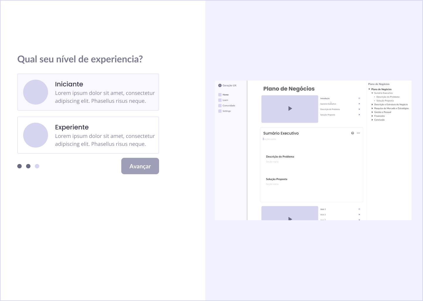
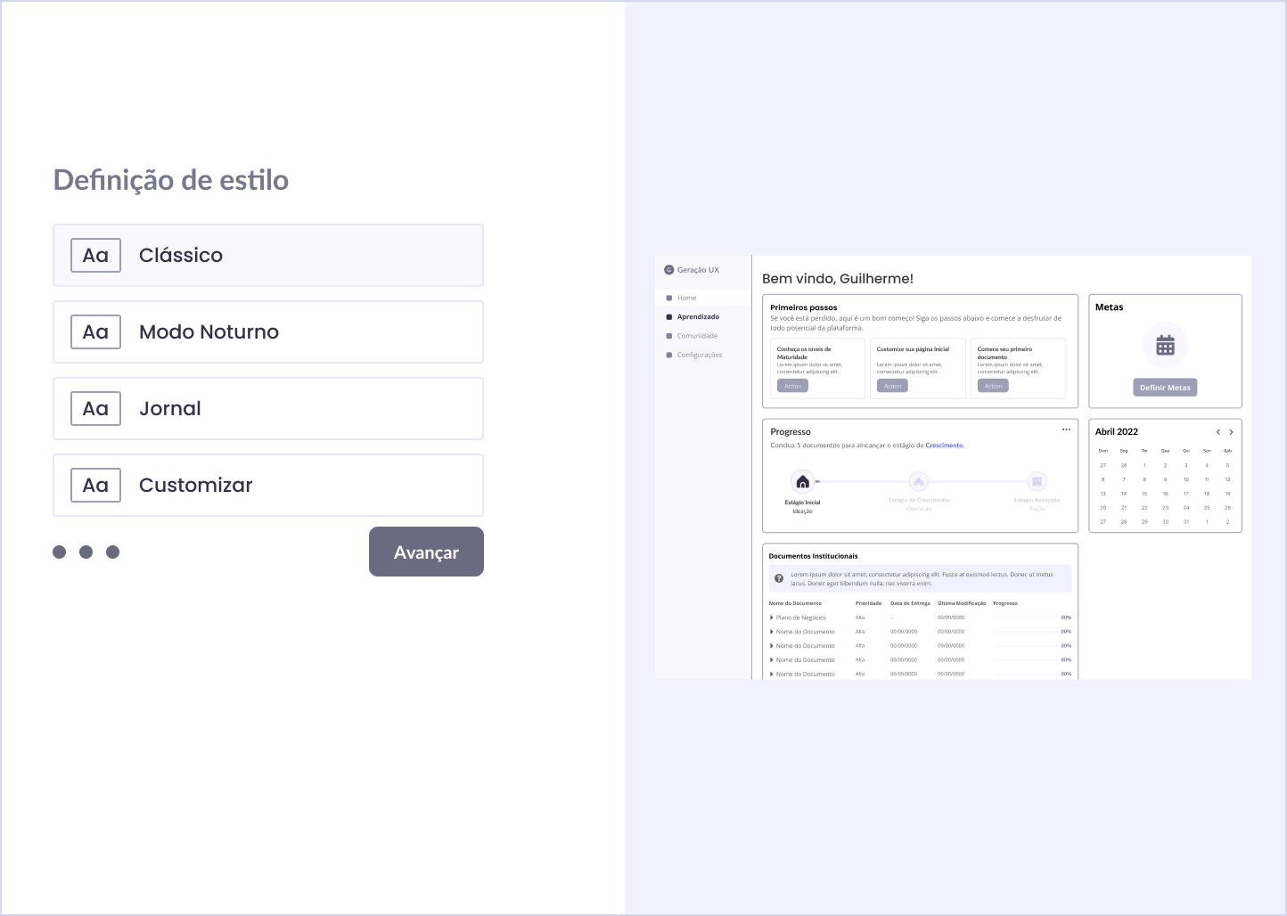
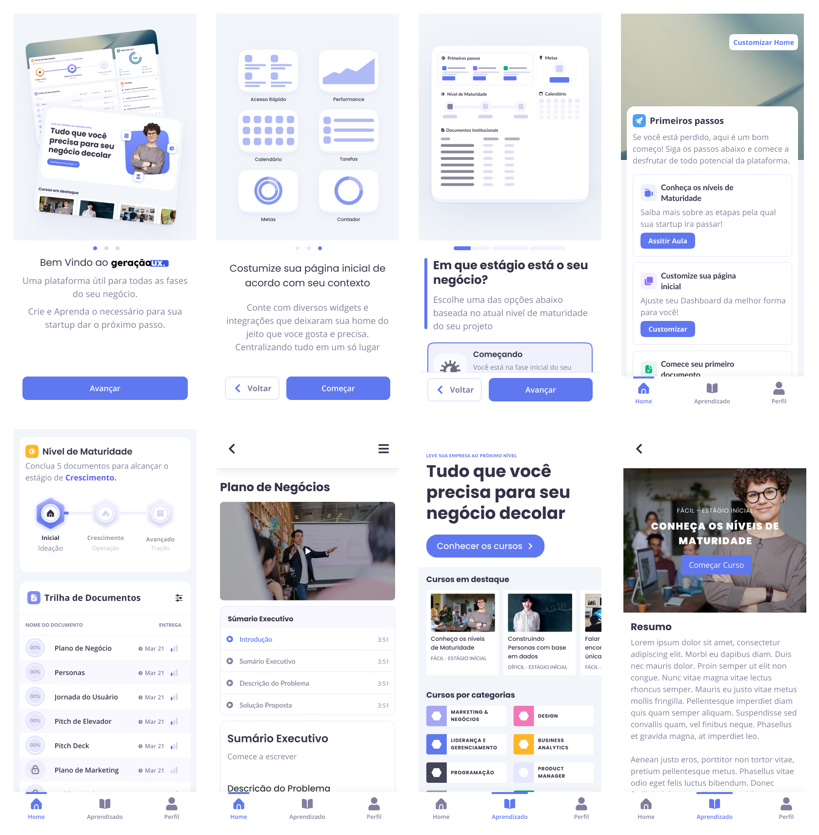
Onboarding Experience
The onboarding consists of three main screens designed to gather essential user information while previewing how their choices will impact their dashboard experience. The interface splits each screen into two sections: user input on the left and real-time preview of their customized interface on the right.
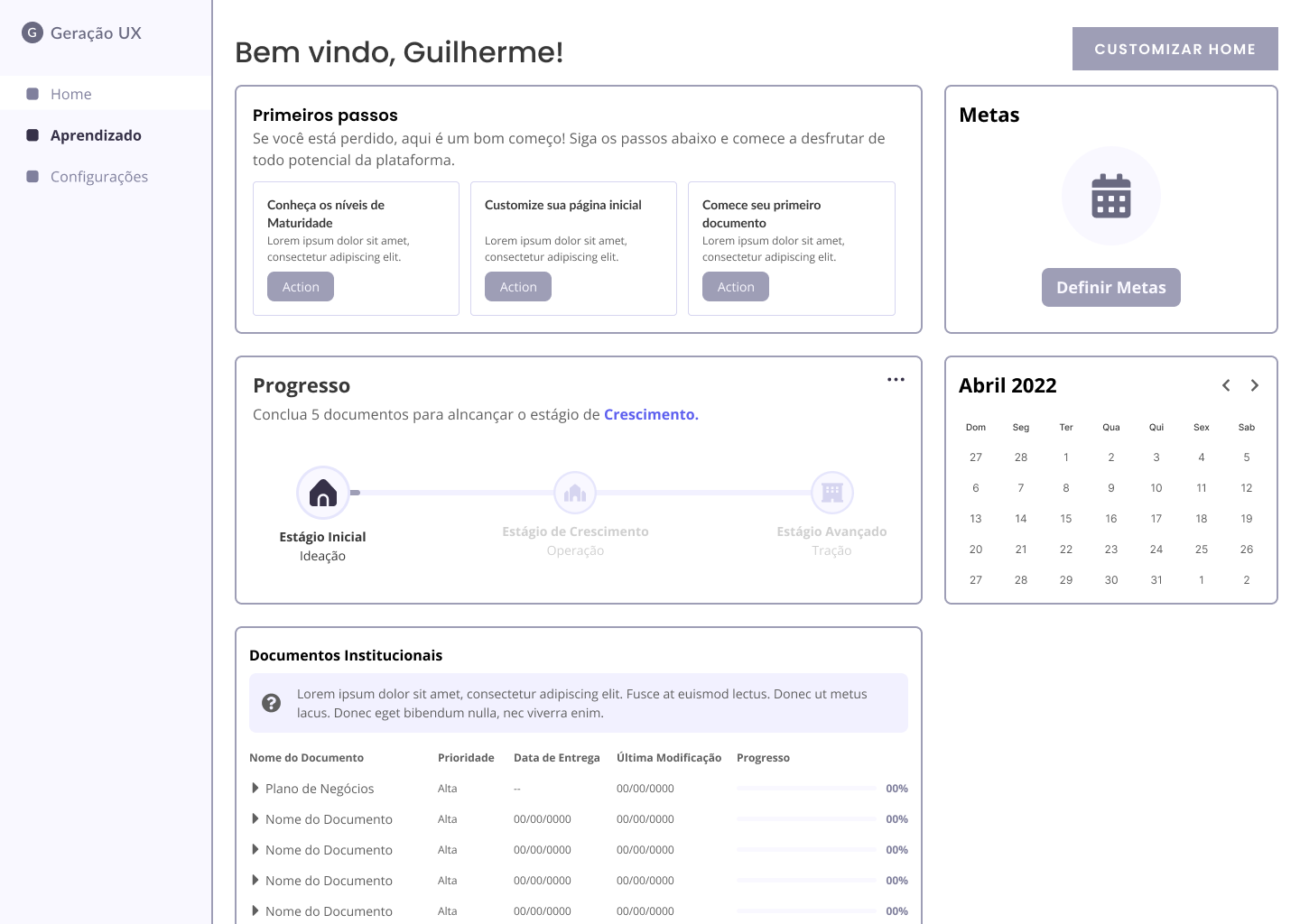
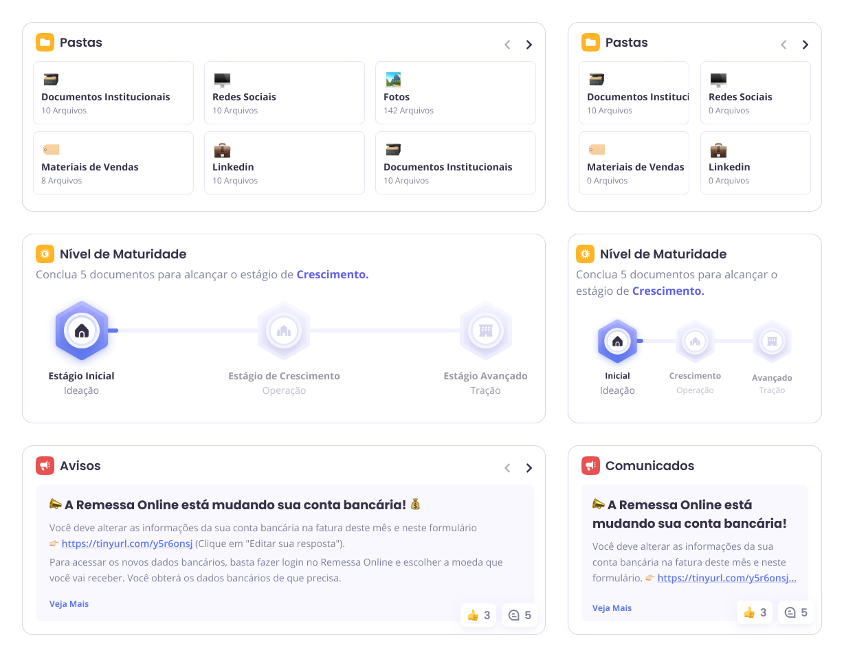
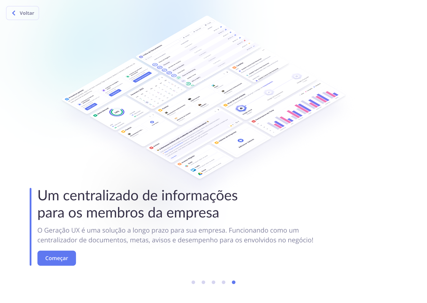
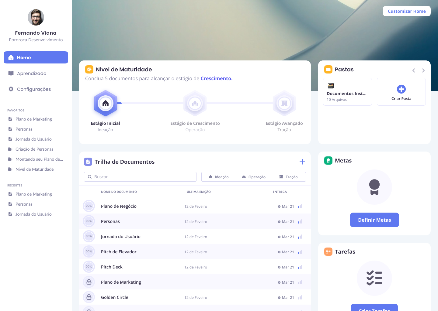
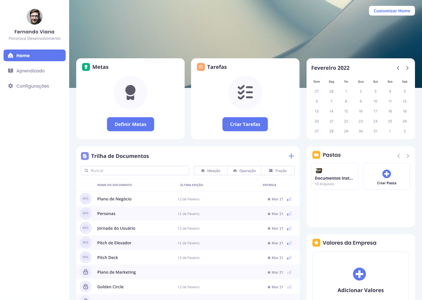
Adaptive Dashboard
The home dashboard serves as the central hub, featuring a "First Steps" widget that guides new users through three initial actions: watching an introductory course, customizing their dashboard, and creating their first document. The layout adapts based on onboarding choices made by each user type.
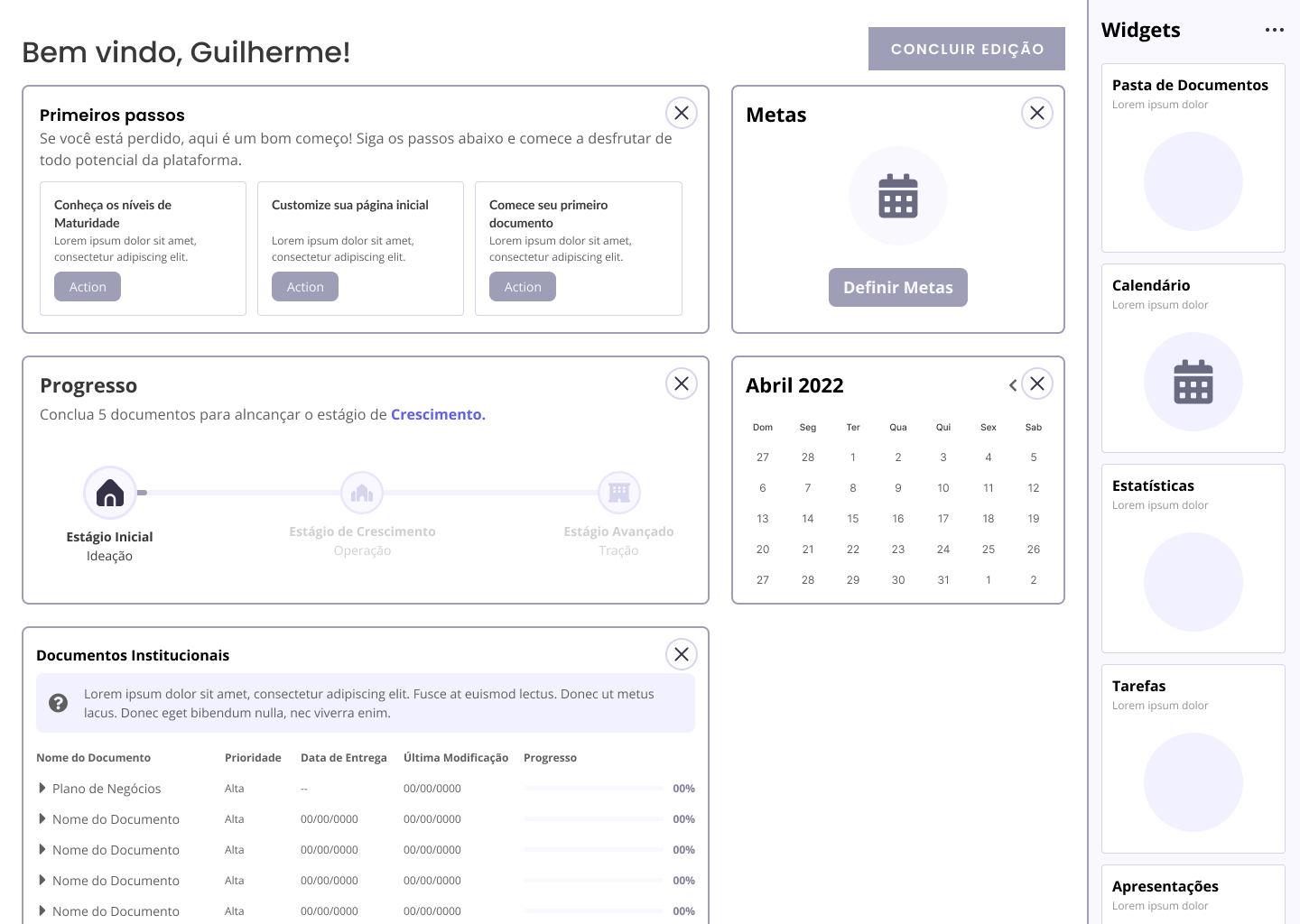
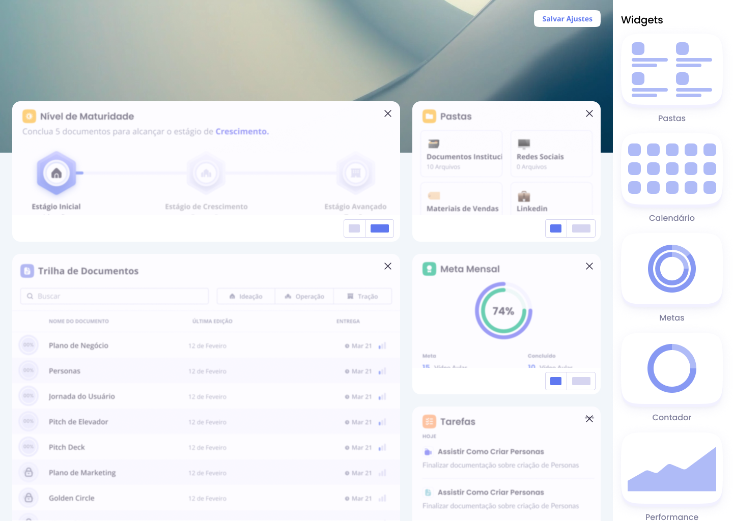
Dashboard Customization
Users can personalize their workspace by adding, removing, and rearranging widgets through a sidebar interface. This functionality ensures the platform grows with the user's business needs and preferences.
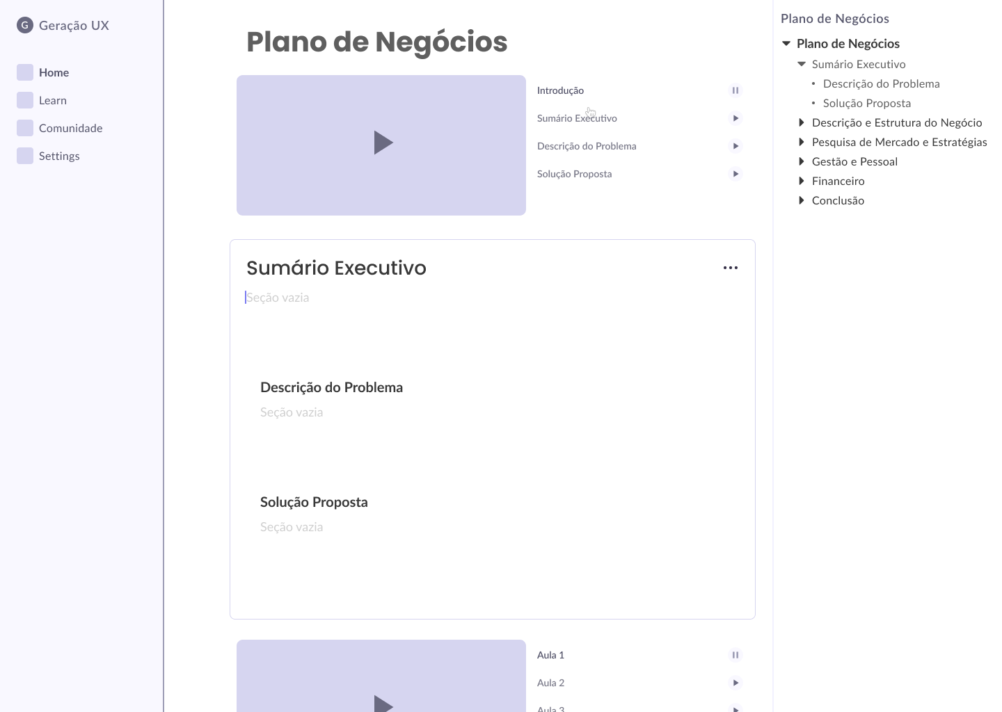
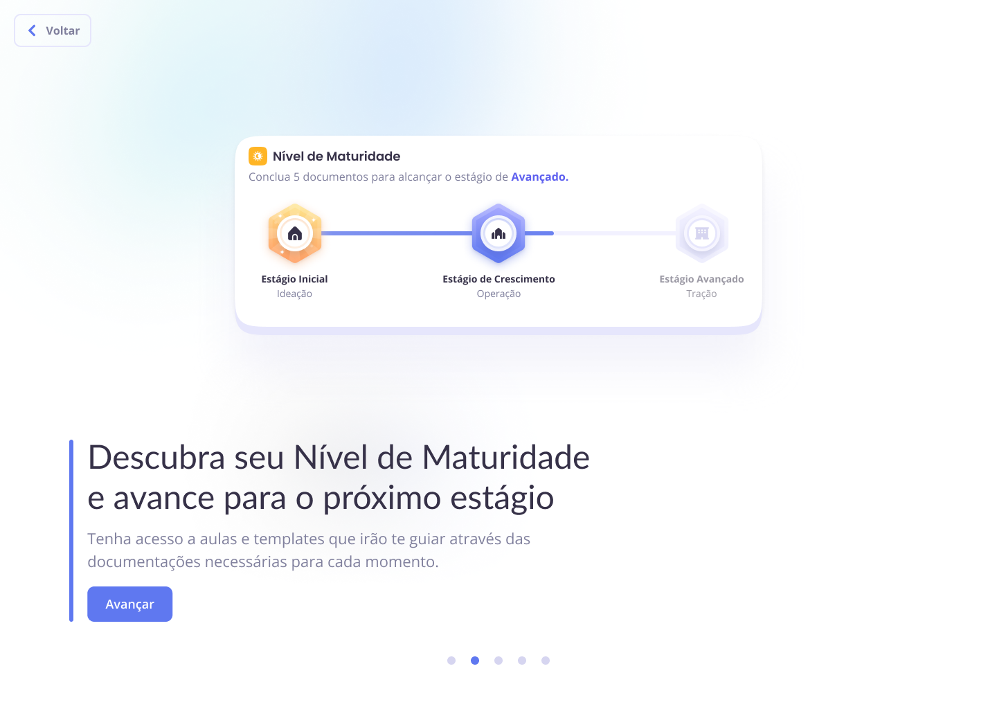
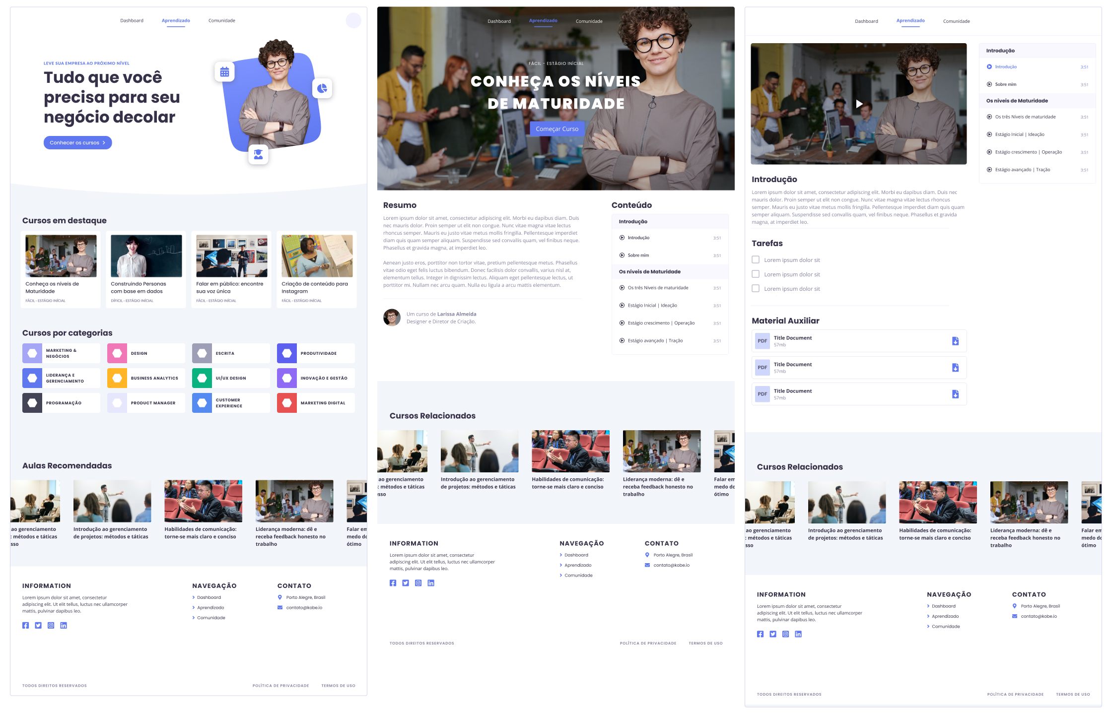
Learning Platform Structure
The learning section provides structured access to courses organized by business maturity levels, featuring course listings, detailed course pages, and individual lesson interfaces with video players and supplementary materials.
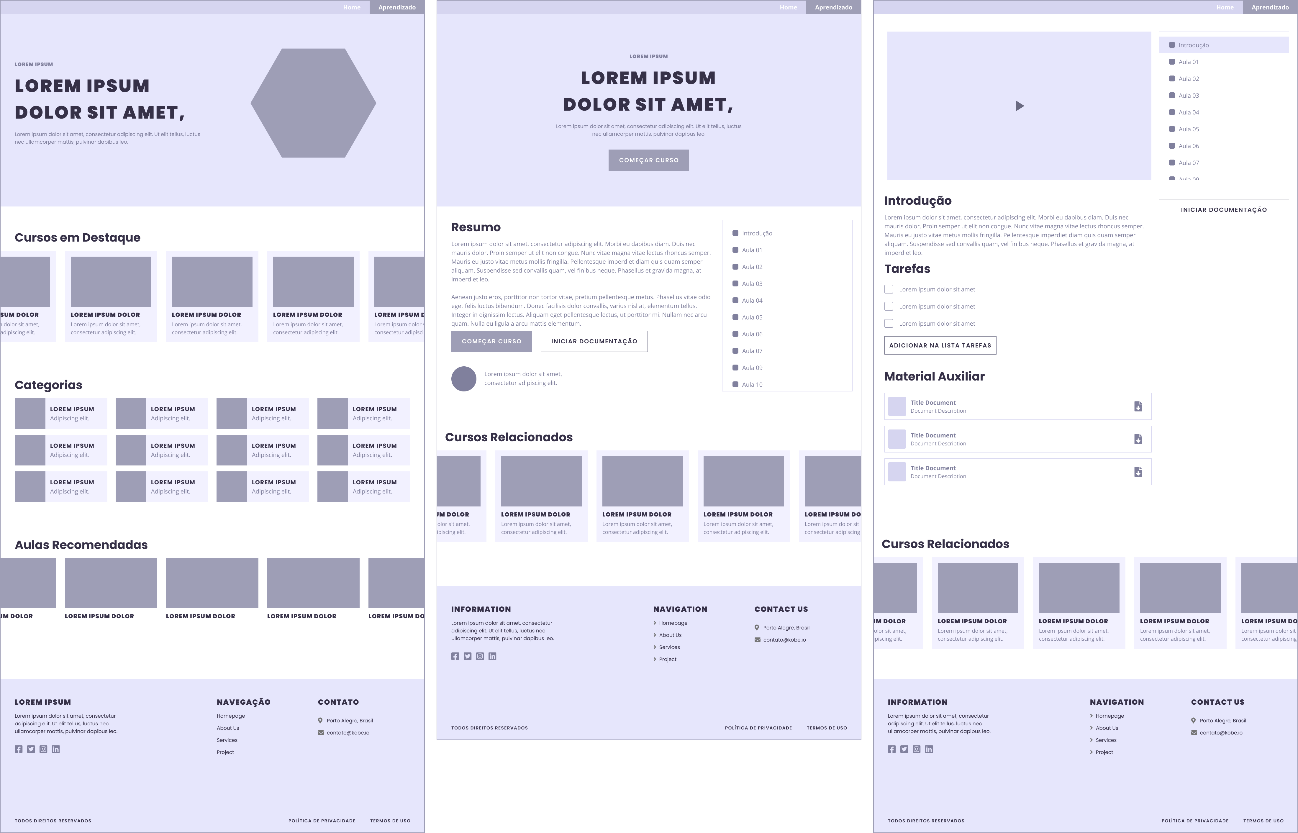
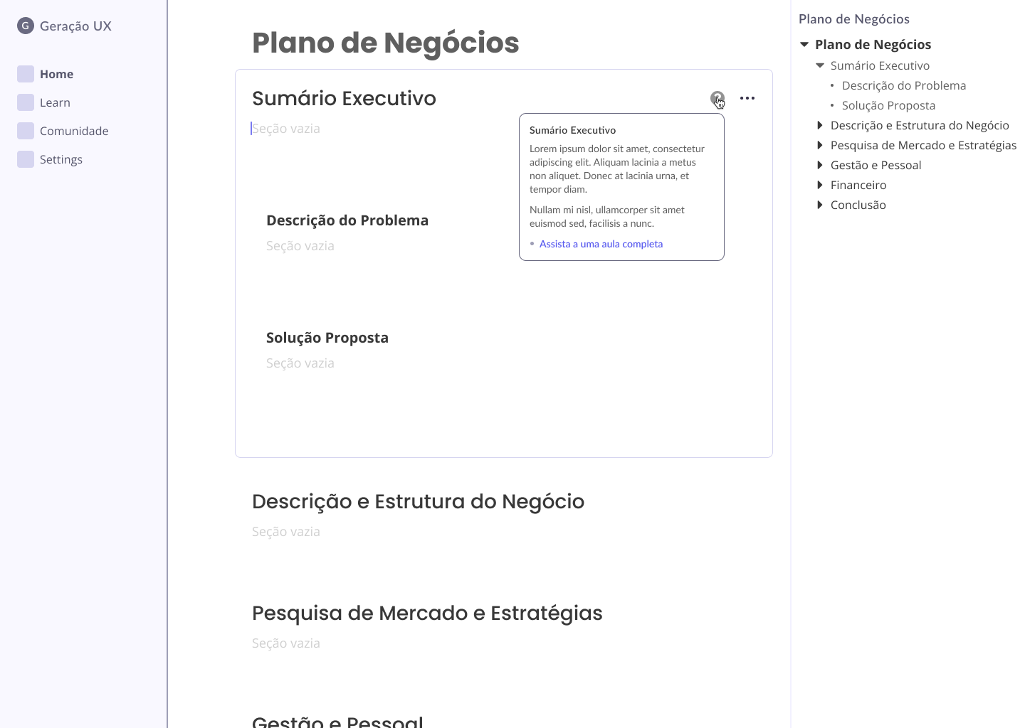
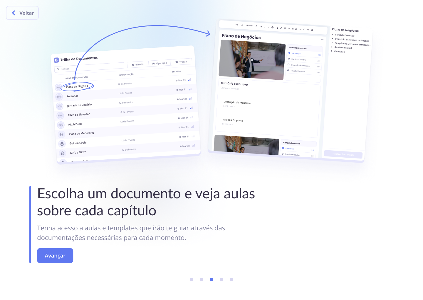
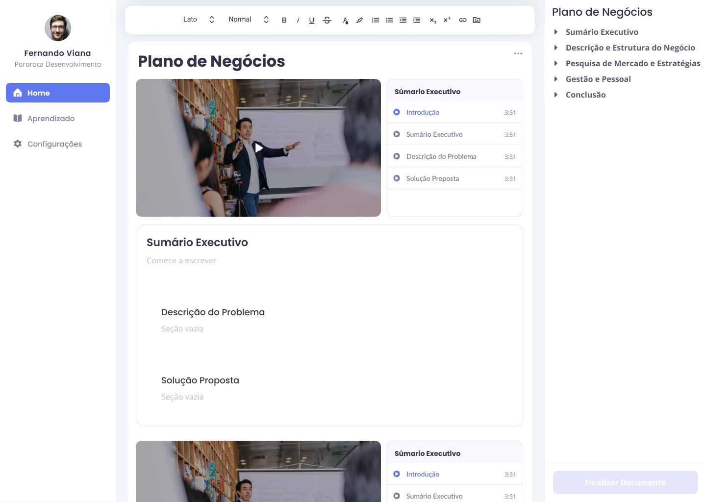
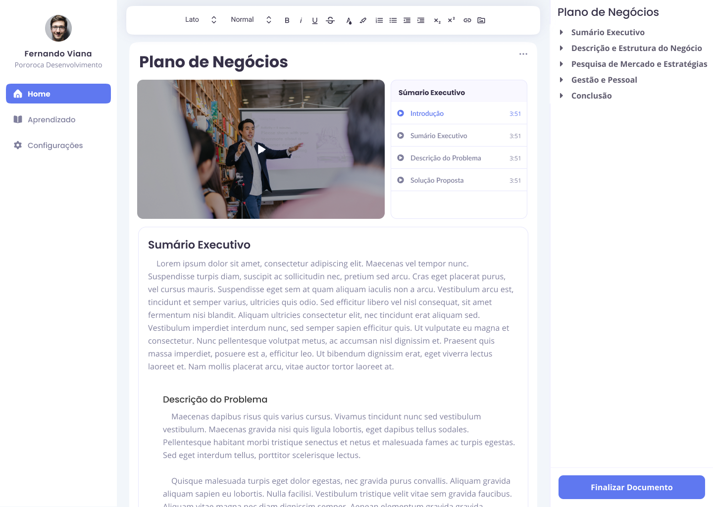
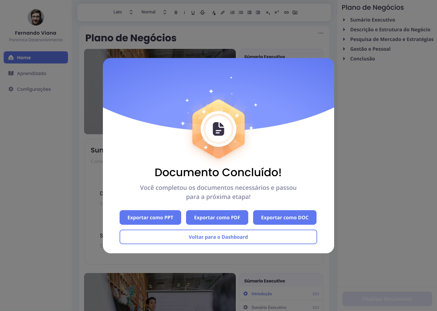
Document Editor Interface
Two versions of the document editor were designed to accommodate different experience levels. Beginners receive a video-enhanced interface with guided explanations for each section, while experienced users get a cleaner interface with contextual help available on hover.
Visual Design & Interface
The visual design adapted Kobe's minimalist brand identity while enabling user customization. The platform needed to feel professional and trustworthy (essential for educational content) while allowing startups to inject their own brand personality.
Color & Typography Strategy
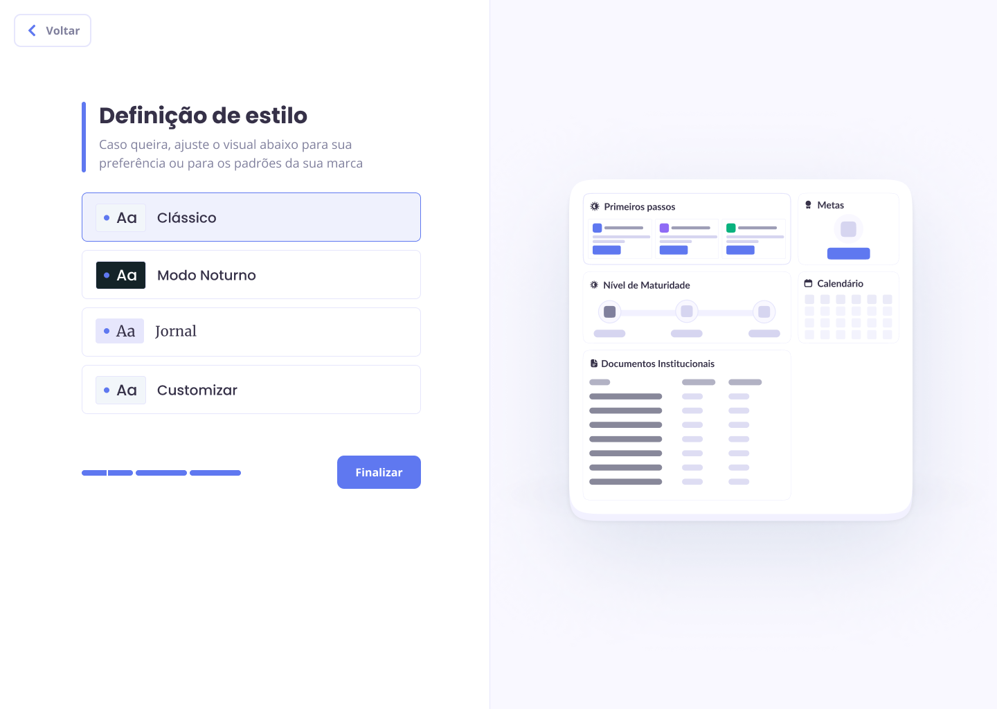
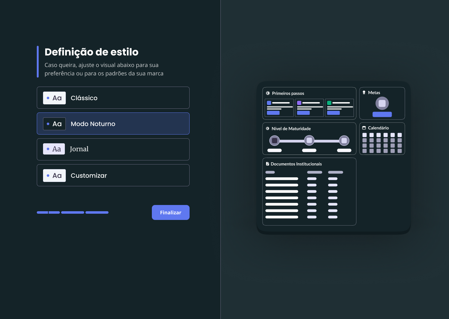
A flexible color system was implemented allowing users to customize their interface during onboarding. The default palette uses Kobe's trust-building blue primary color with clean, accessible neutrals. Users can modify surface colors, backgrounds, primary accent, and typography colors to match their brand identity.
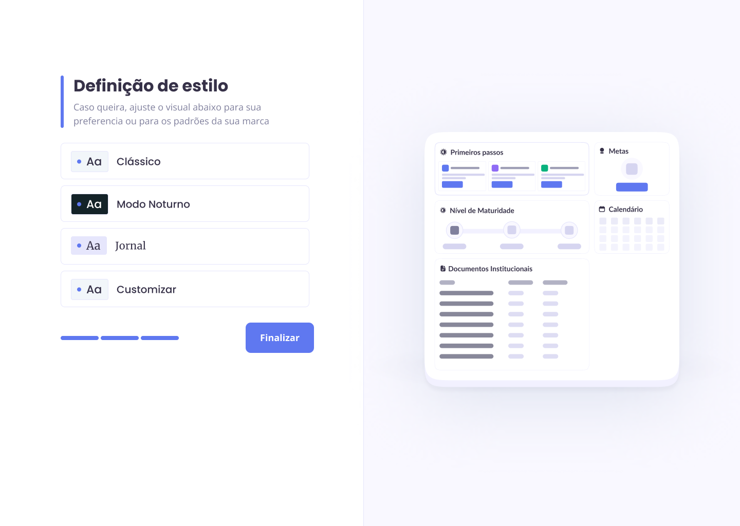
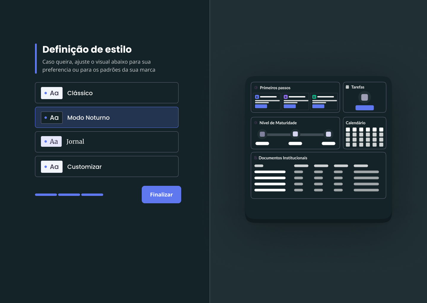
Typography combines Poppins (headings) for its friendly, approachable feel with Open Sans (body text) for optimal readability in dense information layouts. Multiple theme options including Classic, Dark Mode, and Newspaper styles provide quick alternatives for users without established brands.
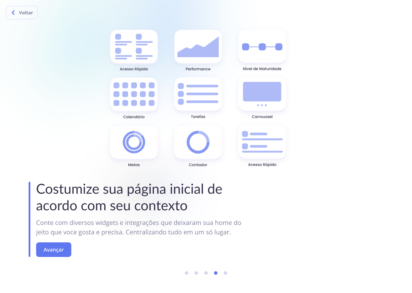
Widget System Design
The modular widget system serves as the platform's core innovation, allowing users to create personalized workspaces that evolve with their business needs. Ten distinct widgets cover essential startup functions from document management to team communication.
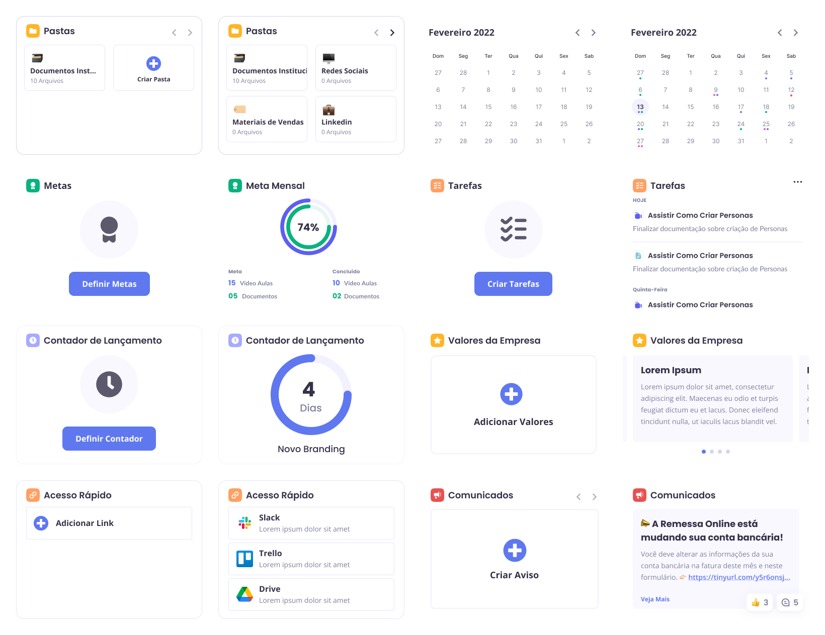
Each widget features two states: initial setup (first-time user) and active use (populated with user content). Widgets can be resized to prioritize different functions - a user might keep document widgets large while minimizing calendar widgets if they work solo.
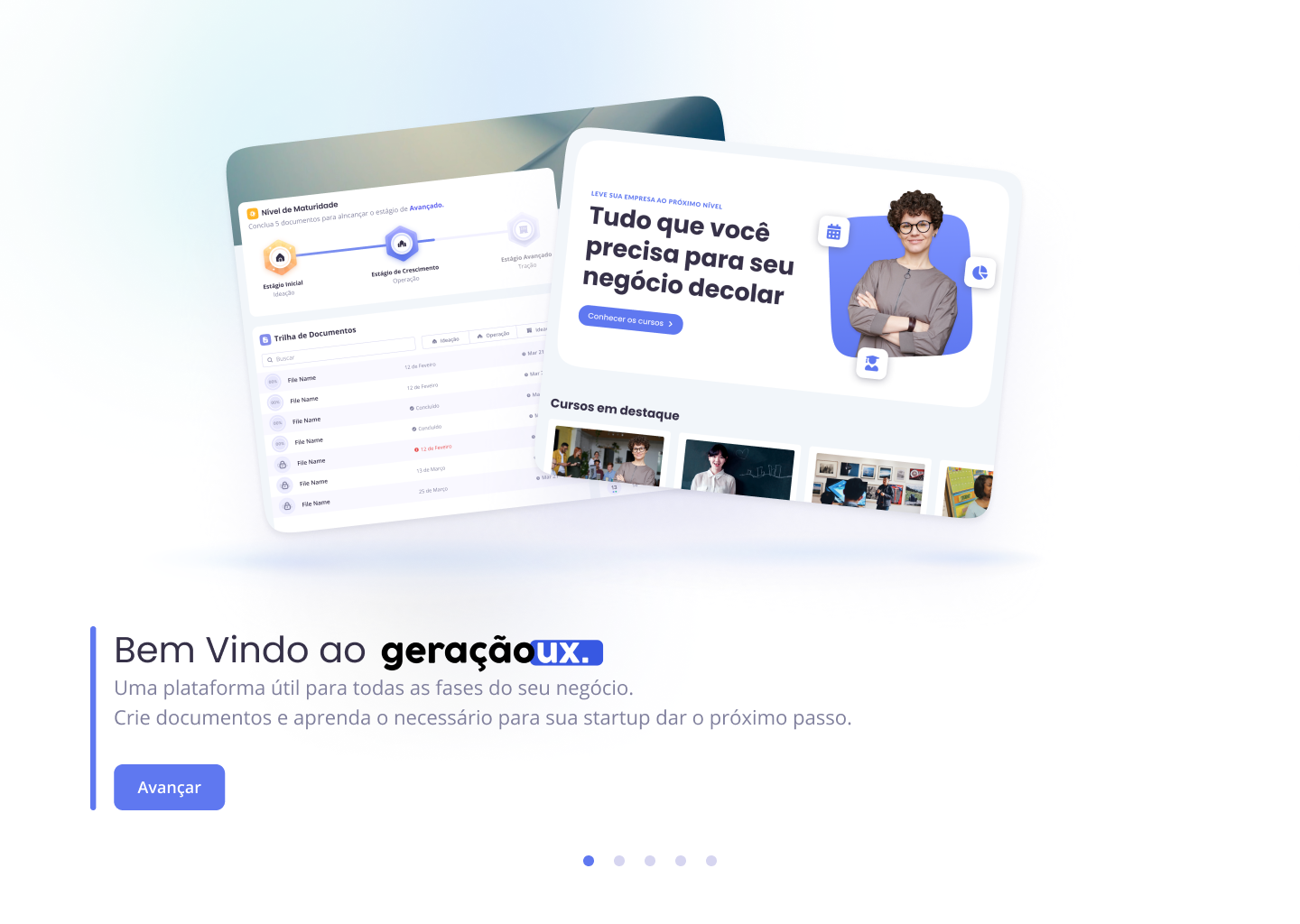
Final Interface Design
The visual design process culminated in a comprehensive interface that translates wireframes into polished, functional screens. The final designs demonstrate how all elements - color customization, typography choices, and widget modularity - work together to create cohesive user experiences for both beginner and experienced entrepreneurs.
Welcome
Onboarding
Dashboard
Learning Platform
Document Editor
Interactive Desktop Prototype: The complete desktop experience can be explored through the interactive prototype, featuring the full onboarding flow, dashboard customization, document creation, and learning platform integration.
Responsive Design
While optimized for desktop use due to the platform's complexity, a simplified mobile version enables basic access to documents and course content. Mobile widgets display in their smallest size, and the navigation adapts to a bottom tab structure for thumb-friendly interaction.
Interactive Mobile Prototype: The mobile experience focuses on essential features with streamlined navigation optimized for touch interaction and smaller screen constraints.
Project Outcomes
The development process successfully translated market research and user needs into a functional learning platform that serves both beginner and experienced entrepreneurs.
Key achievements include:
Validated Solution: Usability testing with 11 users achieved 4.8/5 average scores for onboarding clarity and platform understanding, confirming the adaptive approach effectively serves different user types.Scalable Architecture: The widget-based system and modular content structure provide a foundation that can grow with both individual businesses and the platform's user base.
Business Impact: The platform creates a clear pathway for Kobe to serve previously underserved market segments while building a pipeline to premium services, addressing the core business challenge identified in the marketing analysis.
The final deliverables - interactive prototypes for both desktop and mobile - demonstrate a cohesive solution that bridges startup education with practical business application, ready for development implementation and market validation.
