Binance
During my tenure at Binance US, I contributed to a comprehensive design transformation that began with a complete brand redesign for the American market, where I helped create initial concepts. Following the brand approval, I started the design system development phase under Leo Arten's leadership, focusing on component creation and ongoing system maintenance while ensuring seamless collaboration between design and development teams.
Clients:
Binance

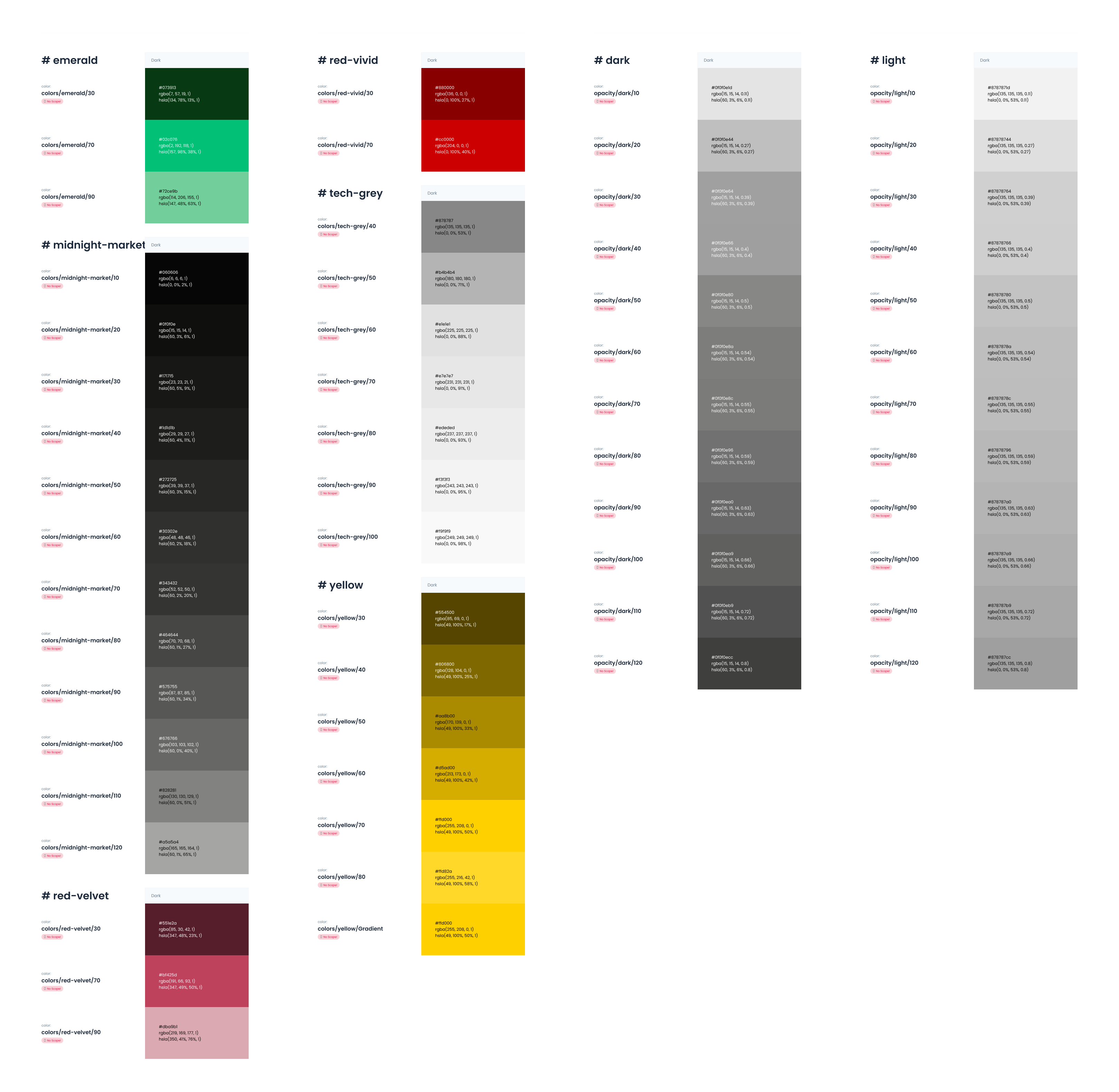
Design Tokens
Three-Layer Architecture
The Binance US design system employs a sophisticated three-layer token architecture that ensures scalability and maintainability across the entire platform.
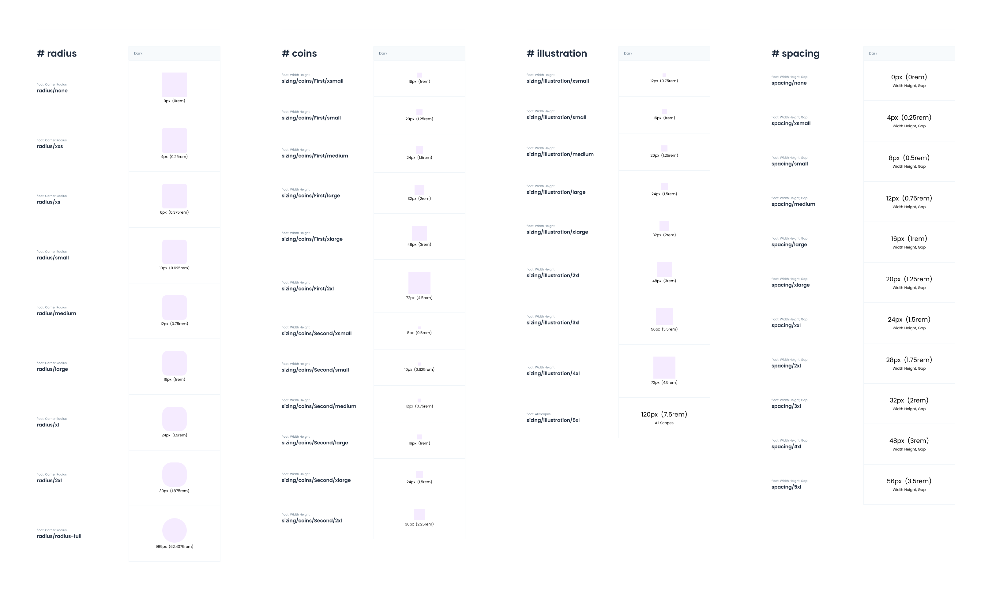
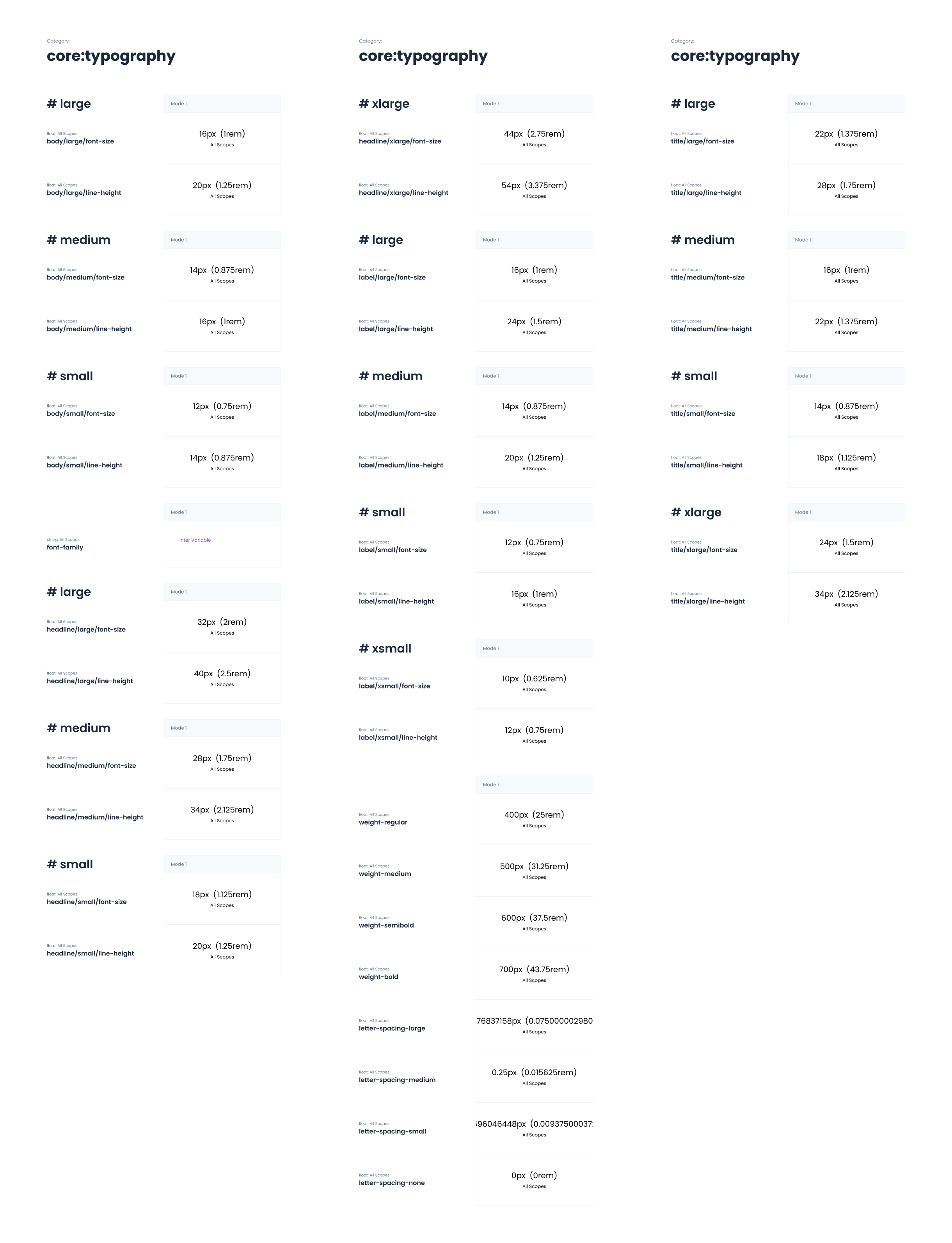
Core Layer
The foundation consists of Core Tokens - the raw values that define the system's DNA:
- Color Palette: Emerald (primary green), Red-velvet, Yellow (brand accent), Tech-gray for neutrals, plus Dark and Light base colors
- Typography Scale: Comprehensive sizing system from large display text to small interface labels
- Foundational Values: Base measurements, spacing, and visual propertie
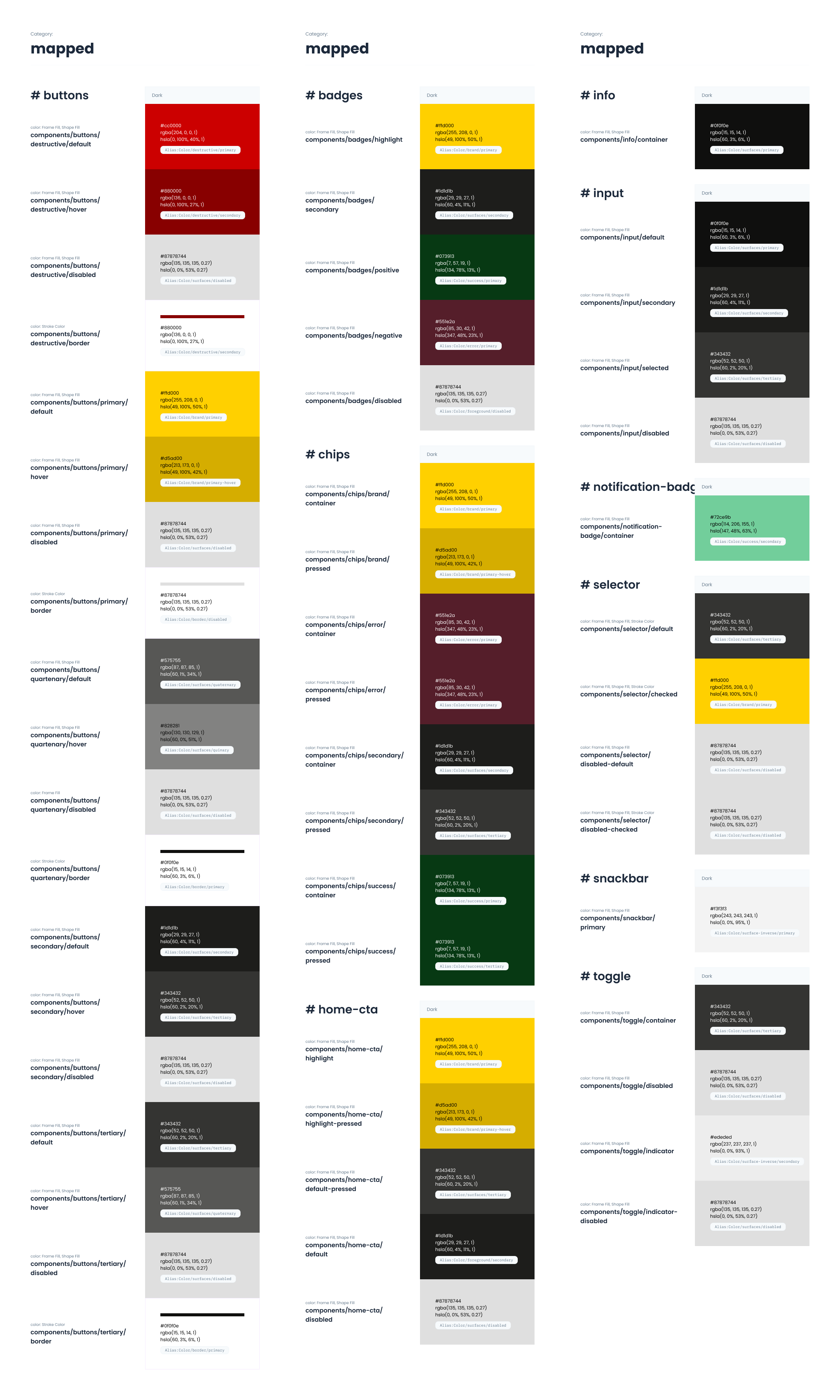
Mapped Layer
Mapped Tokens bridge core values to specific component contexts:
- Component-specific applications like badges, buttons, chips, inputs
- Contextual variations for notifications, selectors, toggles, and snackbars
- Ensures consistent implementation while allowing component flexibility
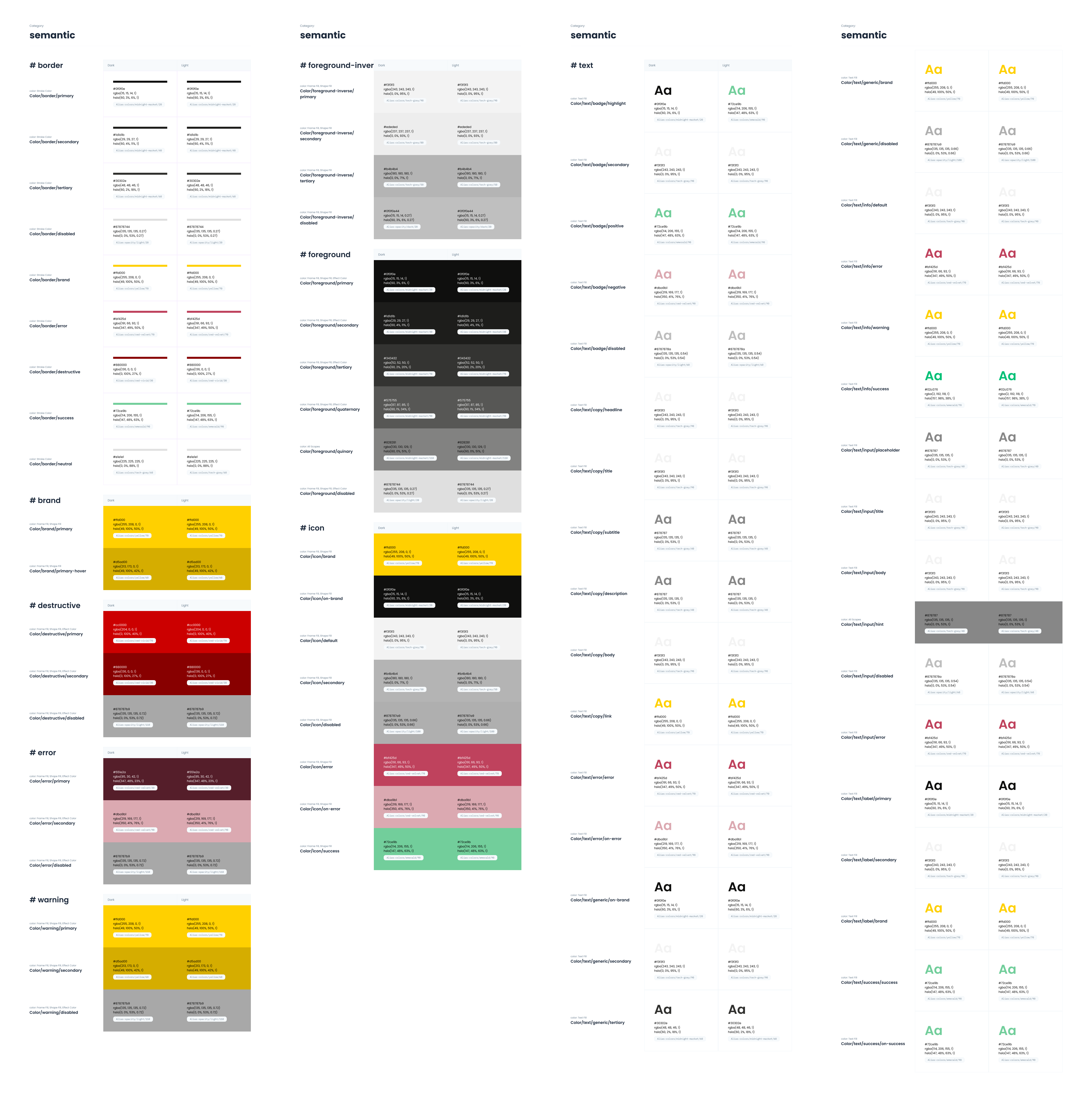
Semantic Layer
Semantic Tokens provide meaning-based naming for intuitive usage:
- Functional Colors: Border, brand, destructive, error, warning states
- Background/Foreground: Context-aware surface and content relationships
- Text Hierarchy: Complete typographic scale for content organization
- Icon System: Consistent iconography tokens across all interface elements
This layered approach enables designers and developers to work with tokens at the appropriate level of abstraction - from foundational core values to specific semantic applications - ensuring both consistency and flexibility in implementation.
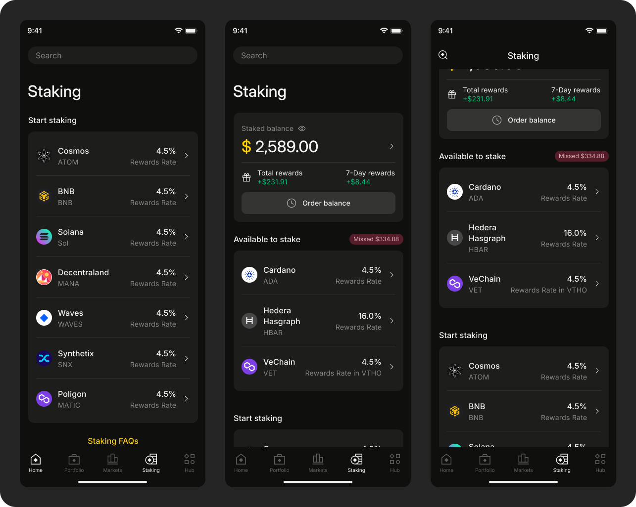
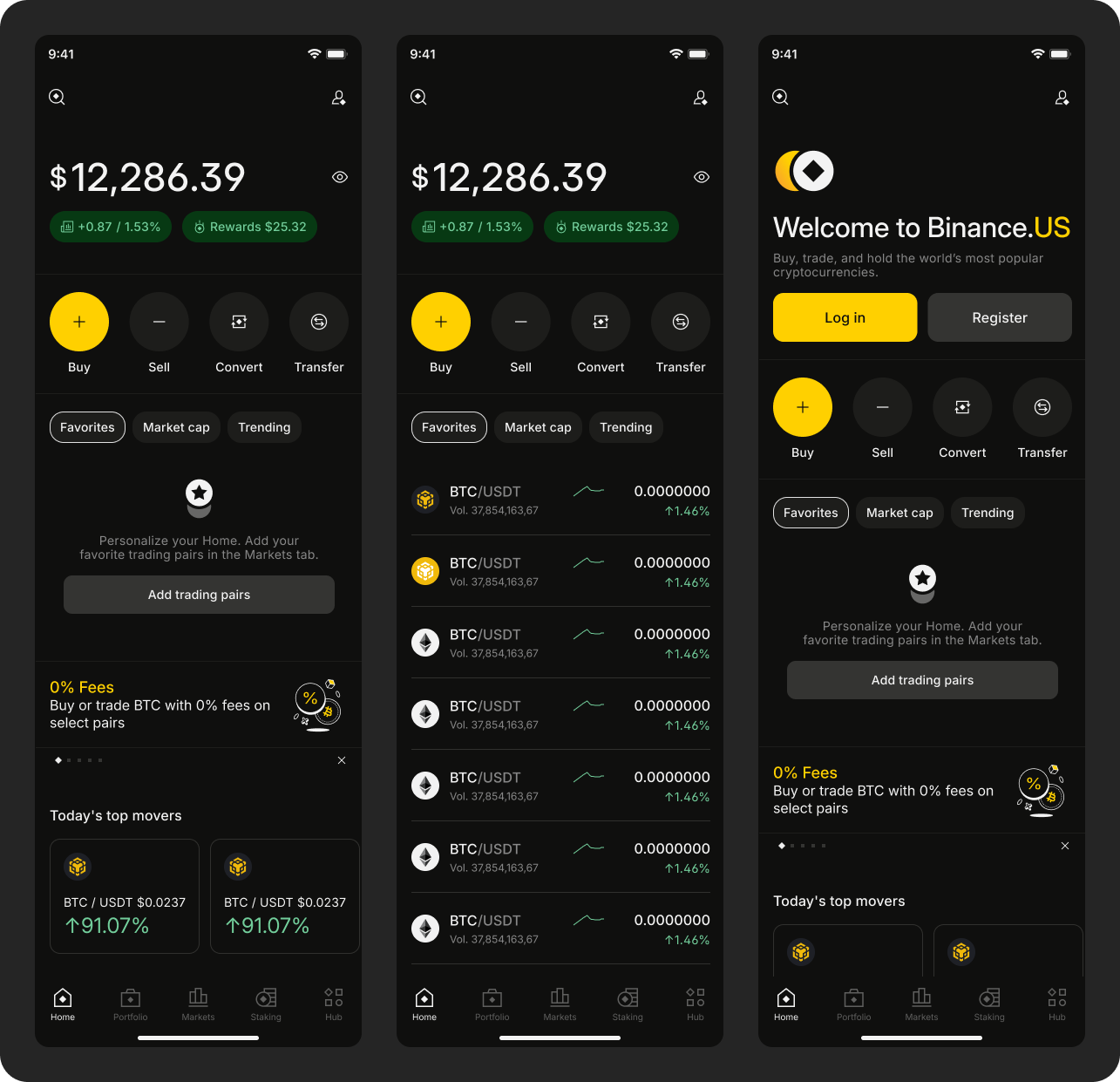
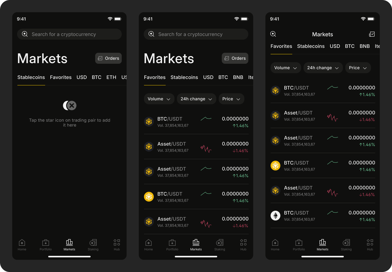
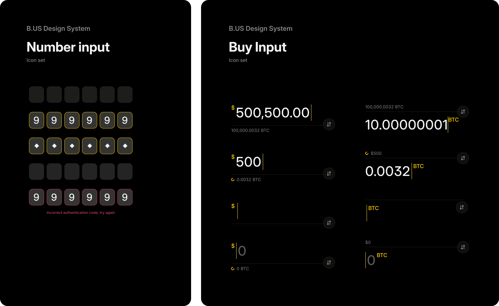
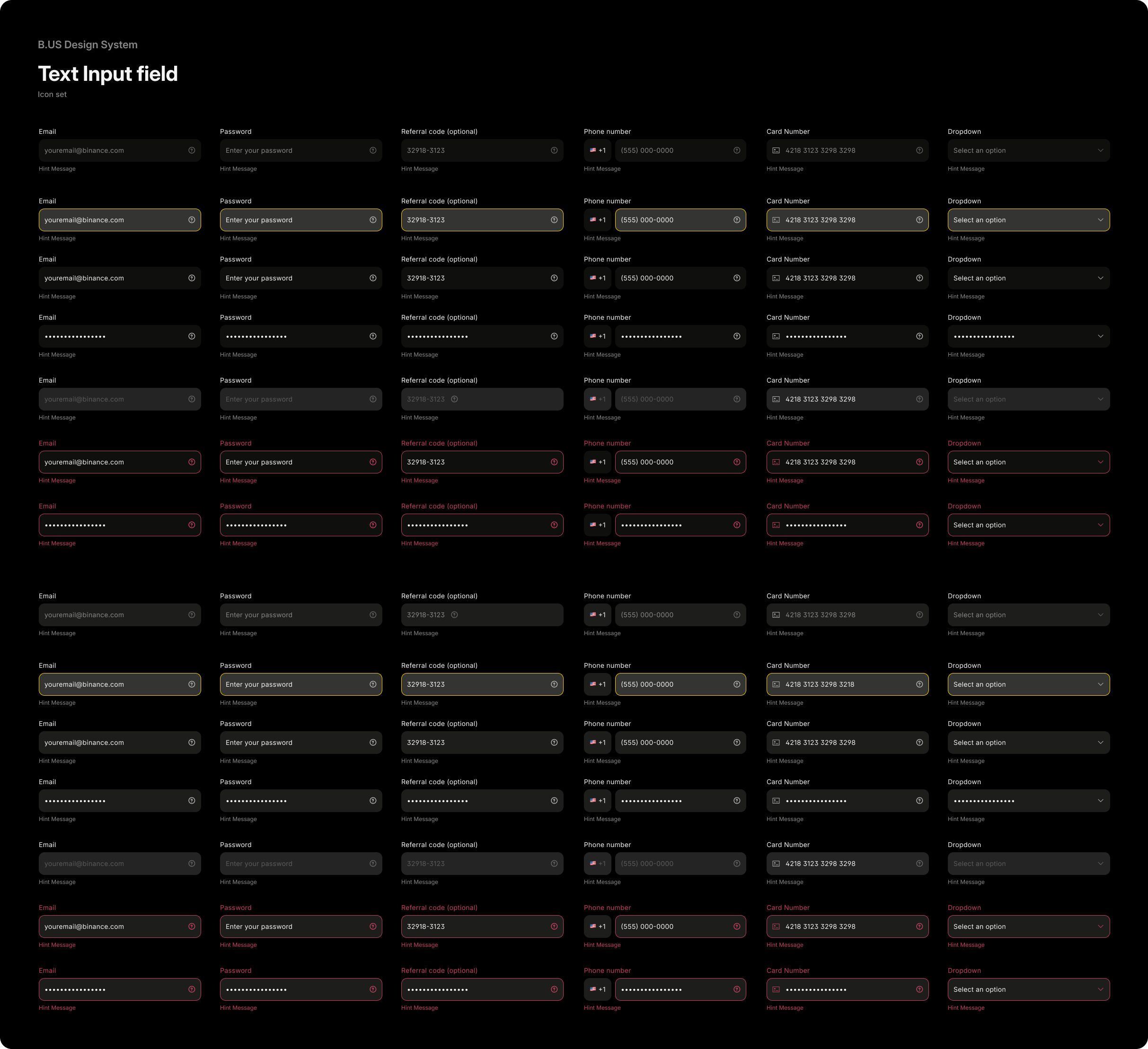
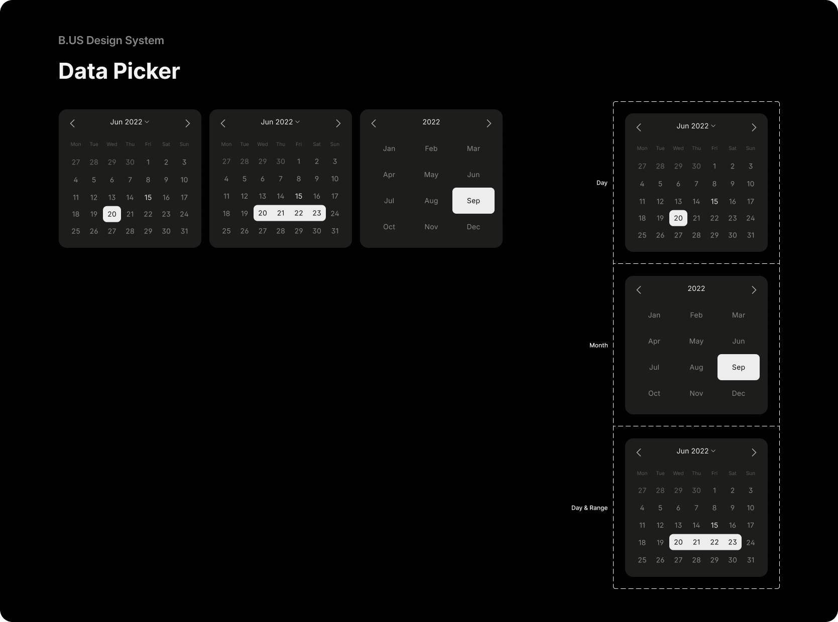
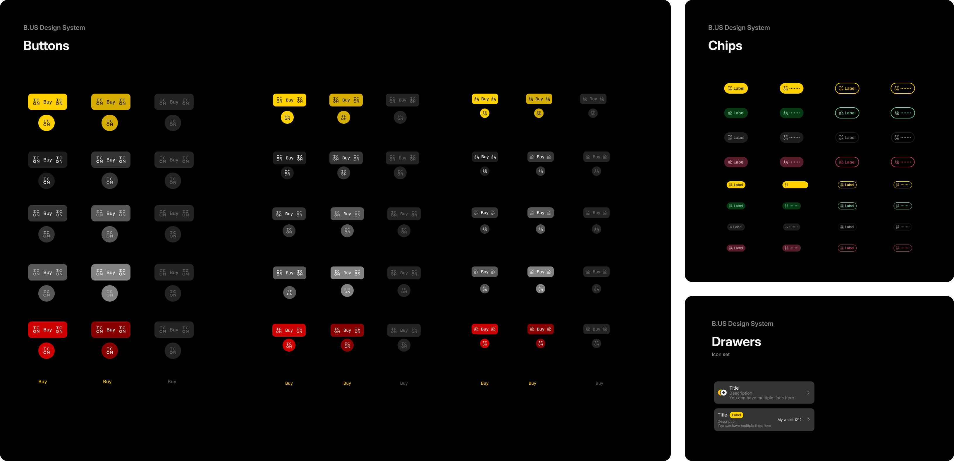
Component Library
The design system includes a comprehensive set of components built on the established design tokens. Following Atomic Design methodology, components are organized in a hierarchical structure from basic atoms to complex organisms, ensuring scalability and reusability across the platform.
Each component maintains consistency across multiple platforms while following the three-layer token architecture for systematic implementation.
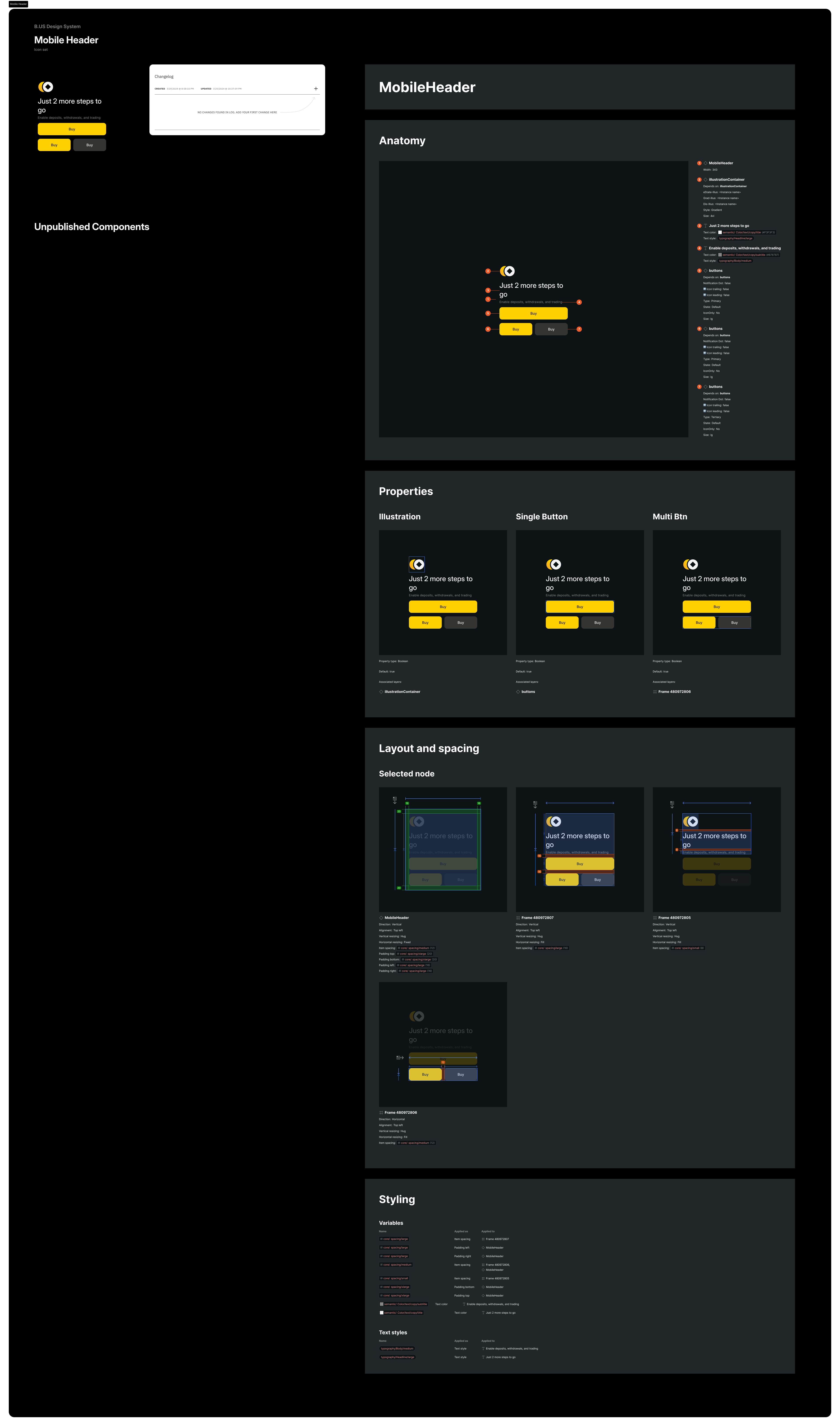
Component Documentation
Each component follows a standardized documentation structure ensuring clear communication between design and development teams:
Anatomy & Properties
- Visual component breakdown with detailed specifications
- Interactive properties and customization options
Layout & Spacing
- Visual component breakdown with detailed specifications
- Node selection views with highlighted dimensions
- Multiple layout contexts demonstrating component flexibility
Technical Specifications
- Comprehensive styling variables and properties
- Text styles and typography applications
- Implementation-ready specifications for developer handoff
This documentation approach ensures consistent implementation while providing the flexibility needed for various product contexts across the Binance US platform.
Screen Application