Ambush
Ambush is a technology consulting company that decided to undergo a rebranding process to better communicate its values and identity. The previous branding lacked deeper meaning and wasn’t fully aligned with the company’s vision for the future. Our work involved creating the new brand identity, as well as designing their new website and various applications such as slides, t-shirts, and more.
This project was developed over the course of three months. I worked on this rebranding alongside Carolina Masuero, with my focus on the art direction, while also receiving valuable support and feedback from Ambush’s talented design team.
Clients:
Ambush

Brand Applications
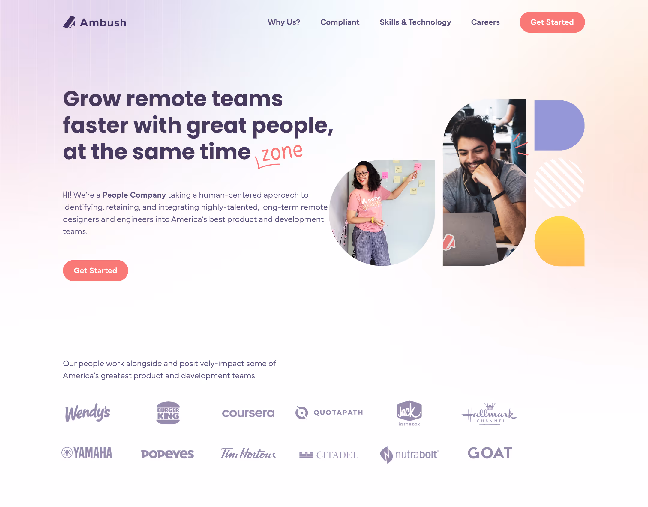
Ambush website
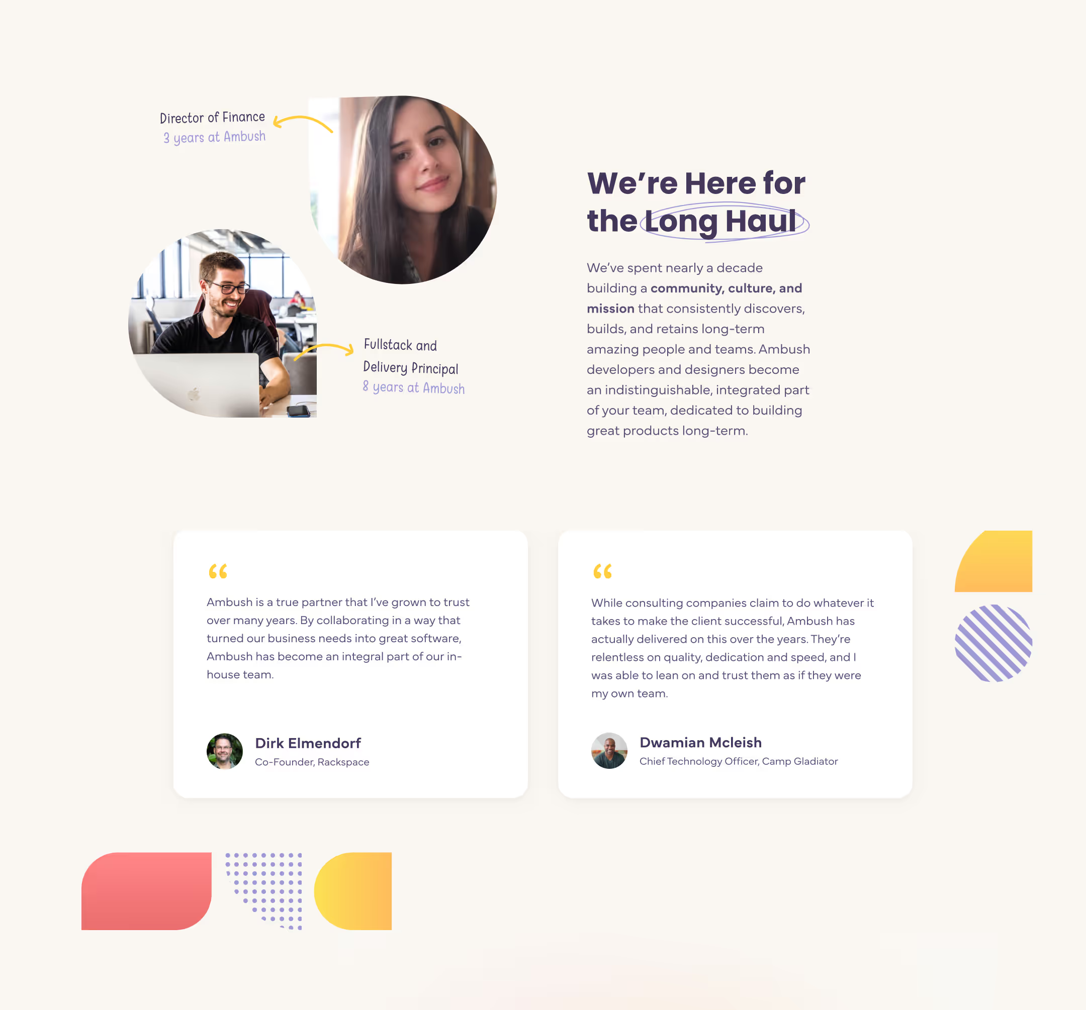
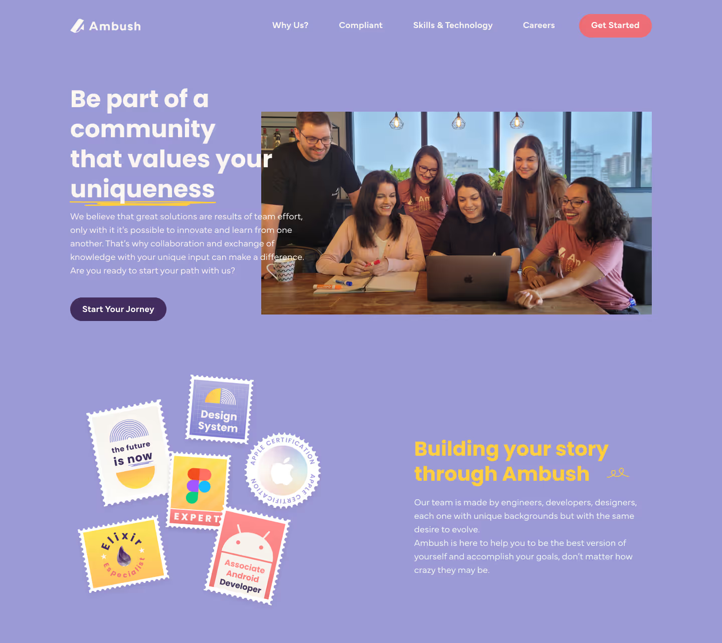
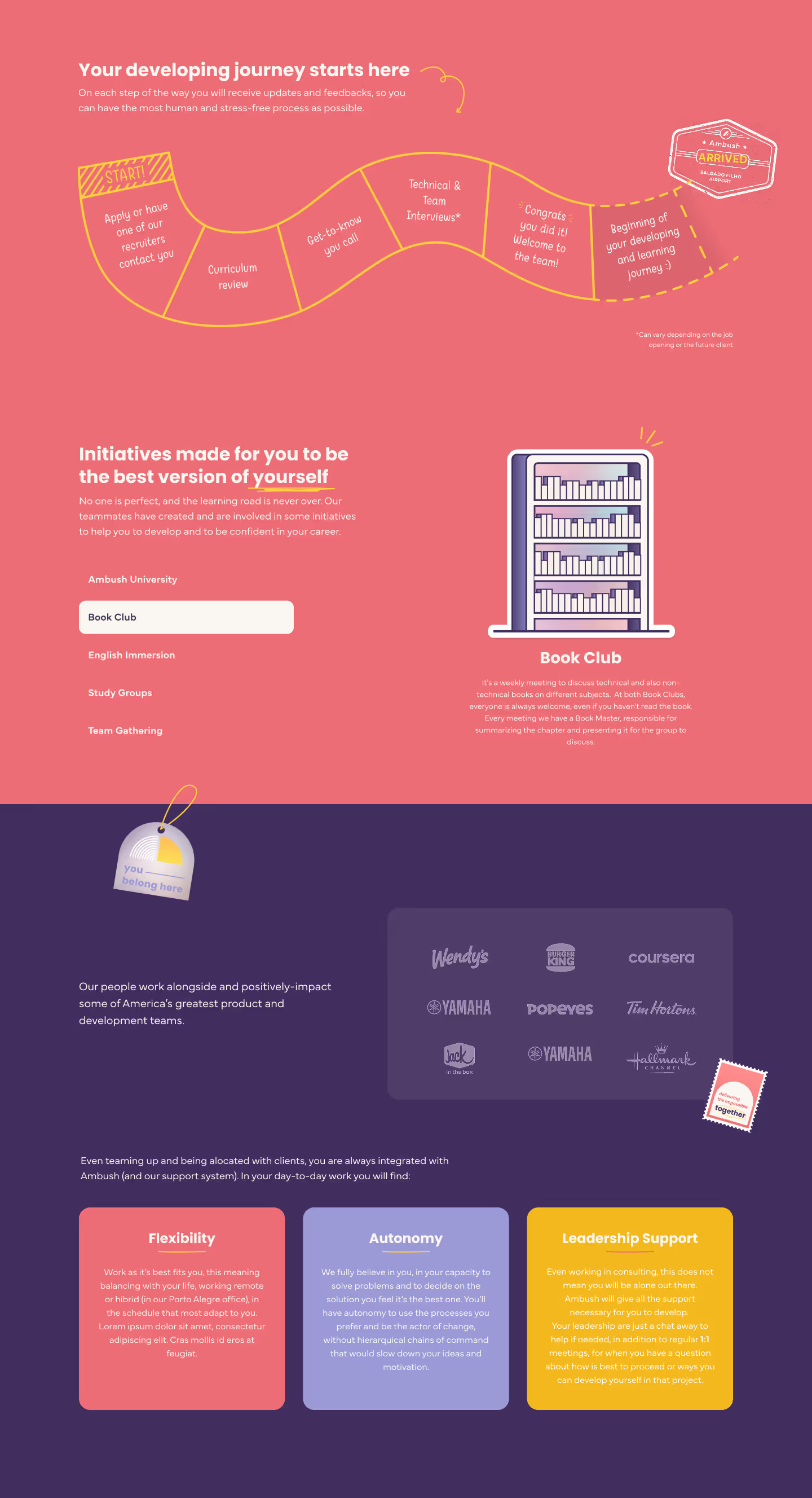
Life at Ambush website
General artwork
Concept Development
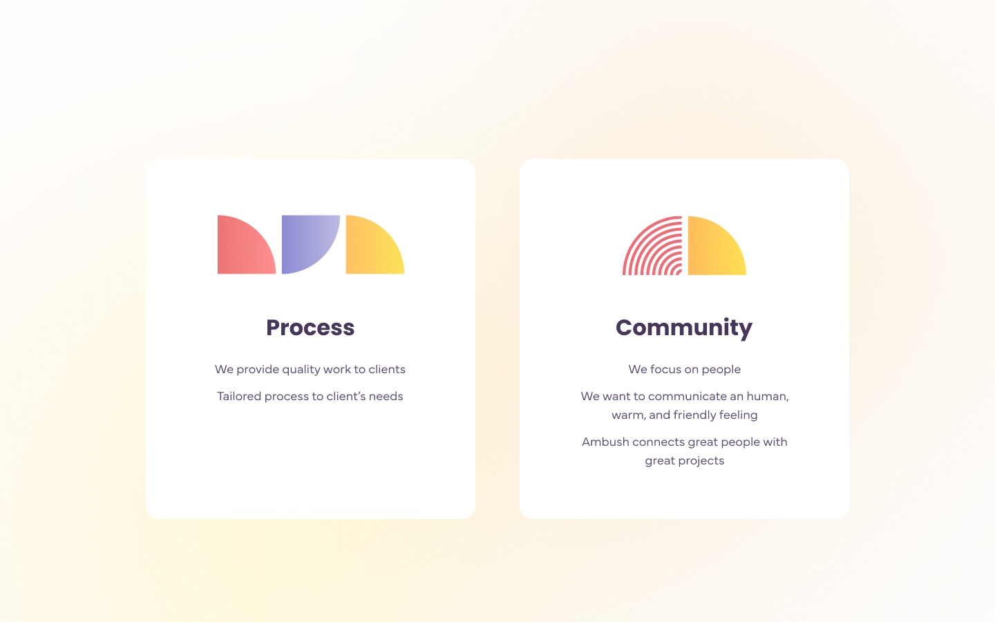
Defining values
The initial phase of the rebranding process involved several collaborative workshops and exercises, including tools like the 20-Year Plan, What-How-Why framework, Audience Mapping, Brand Personality definition, and so on. One of the most impactful exercises was identifying the brand’s core values, which became a key foundation for many design decisions along the way. For Ambush, these values were defined as Process and Community.
Logo creation
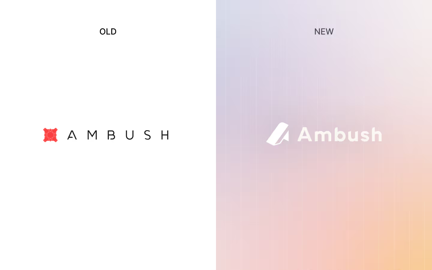
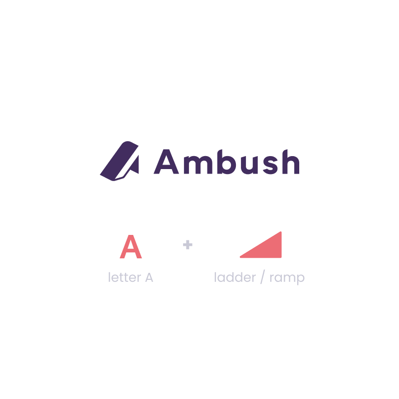
After the initial workshops, we conducted numerous tests and explorations with different logo concepts until we found a solution that truly represented what we were aiming for.
Ambush is all about the people, and how we can make each other better and improve also our projects.
For this alternative the inspiration was a ladder, communicating how our company can rise each other and also the clients.
The logo in perspective with depth conveys that Ambush is a strong and stable brand, down-to-earth.Also, the angled cuts in the letters offer a more modern touch to the brand.
For this alternative the inspiration was a ladder, communicating how our company can rise each other and also the clients.
The logo in perspective with depth conveys that Ambush is a strong and stable brand, down-to-earth.Also, the angled cuts in the letters offer a more modern touch to the brand.
Art direction
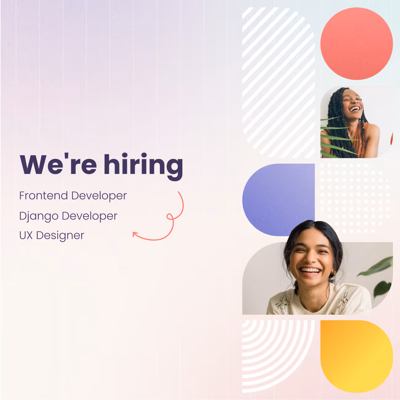
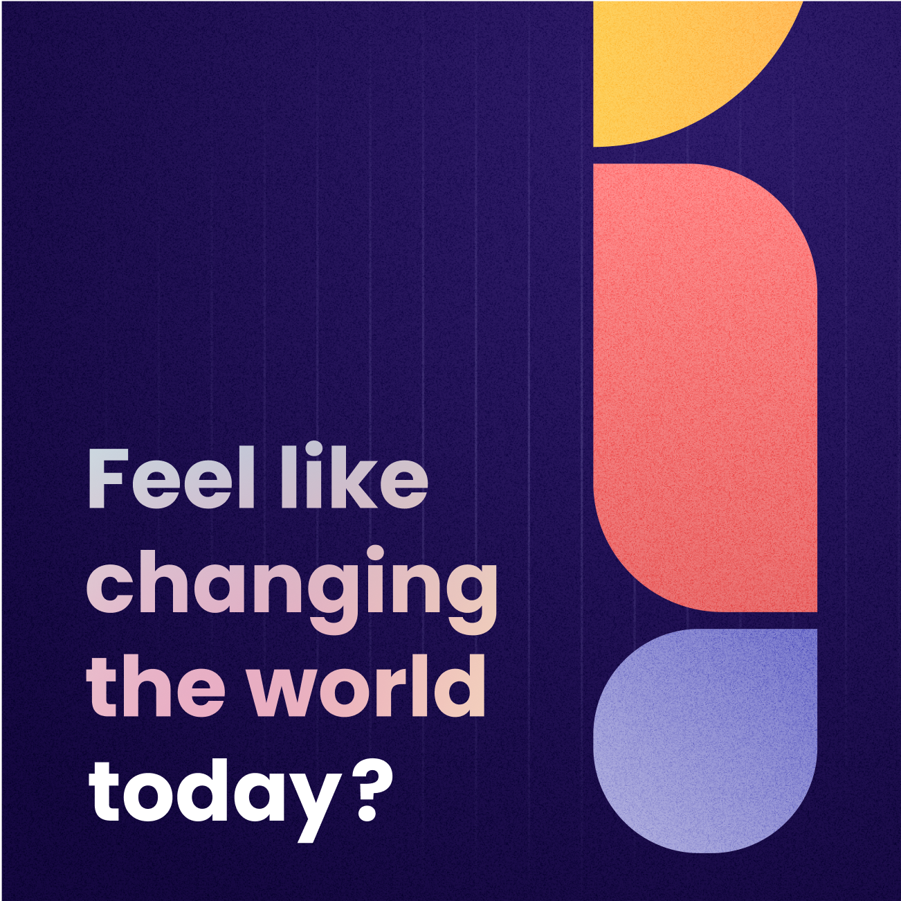
The brand values were fundamental in guiding the development of the art direction. They provided a clear foundation for building a cohesive color palette and visual elements that worked harmoniously together. As a result, the visual style became vibrant, fun, and approachable.
How do we represent Community?
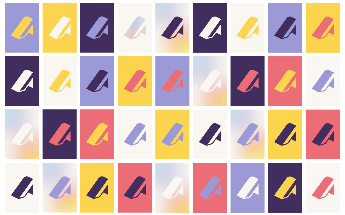
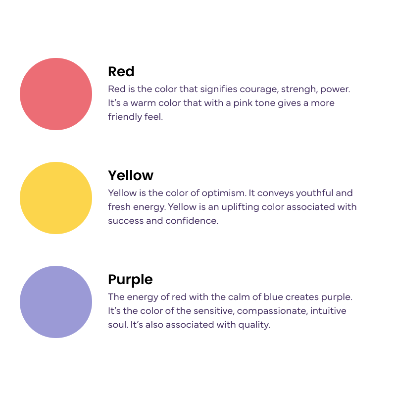
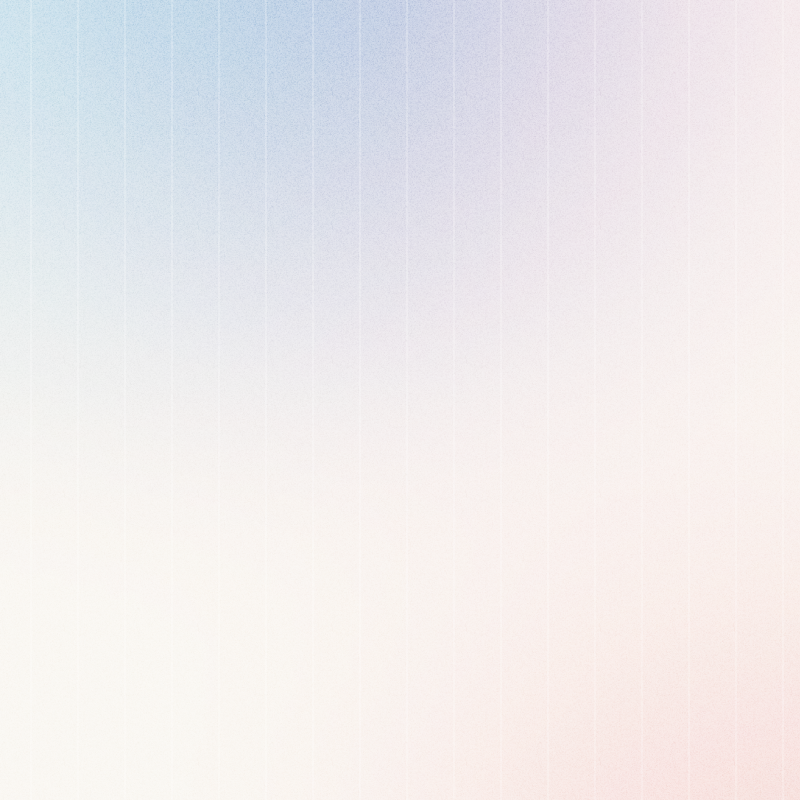
To represent the idea of community, color became our strongest ally. The first step was defining our primary colors: red, yellow, and purple. This choice created a warm palette. However, when used separately, these colors didn’t fully capture the essence of community.
That’s why we decided to blend them into gradients, where the colors come together to form vibrant and dynamic backgrounds. This union of colors symbolizes how different elements work collectively, creating a strong and cohesive foundation for our visual identity.
That’s why we decided to blend them into gradients, where the colors come together to form vibrant and dynamic backgrounds. This union of colors symbolizes how different elements work collectively, creating a strong and cohesive foundation for our visual identity.


How do we represent Process?
To visually represent process, we incorporated three key elements. First, we adopted a Bauhaus-inspired approach, using geometric shapes to convey structure and clarity. Second, we relied on grids to bring organization and alignment to the compositions. Finally, we introduced doodles to add a touch of creativity and human expression, balancing the systematic with the playful.
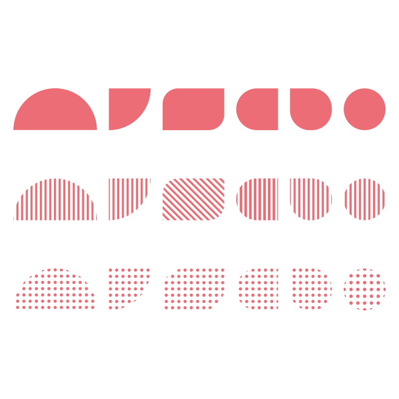
Geometric shapes
To represent process, we took inspiration from the Bauhaus, renowned for its focus on structured design and functional beauty. We used geometric shapes reflecting Bauhaus aesthetics, and created different patterns that can be mixed and layered, communicating a diversity of ideas while ensuring layouts remain balanced and harmonious.
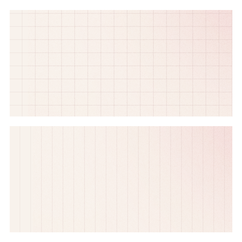
Grids
Grids played a key role in representing the idea of process. They provide structure and organization, helping to arrange content in a clear and consistent way. Beyond their practical function, grids also symbolize the systematic and methodical approach behind every step of the work, ensuring balance and harmony in the final designs.
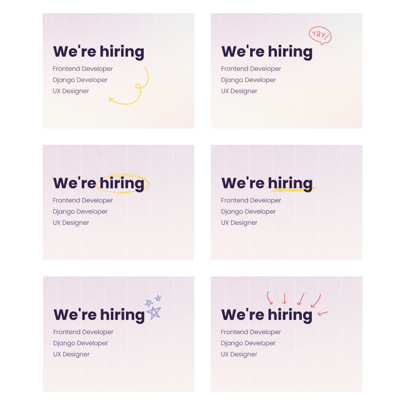
Doodles
Grids played a key role in representing the idea of process. They provide structure and organization, helping to arrange content in a clear and consistent way. Beyond their practical function, grids also symbolize the systematic and methodical approach behind every step of the work, ensuring balance and harmony in the final designs.